pacman::p_load(tidyverse, ggstatsplot)
set.seed(1234)In-class Exercise 4: Visualizing Stats and Models
1 Overview
ggstatsplot enable plotting without calculating the statistics separately.
2 Getting Started
2.1 Loading the required packages
For this exercise we will use the following R packages:
tidyverse, a family of modern R packages specially designed to support data science, analysis and communication task including creating static statistical graphs.
ggstatsplot, extension of ggplot2 package for creating graphics with details from statistical tests included in the information-rich plots themselves.
2.2 Loading the data
We will use the same exam_data dataset from Hands-on Ex 1 and load it into the RStudio environment using read_csv().
exam_data <- read_csv("data/Exam_data.csv")
glimpse(exam_data)
Rows: 322
Columns: 7
$ ID <chr> "Student321", "Student305", "Student289", "Student227", "Stude…
$ CLASS <chr> "3I", "3I", "3H", "3F", "3I", "3I", "3I", "3I", "3I", "3H", "3…
$ GENDER <chr> "Male", "Female", "Male", "Male", "Male", "Female", "Male", "M…
$ RACE <chr> "Malay", "Malay", "Chinese", "Chinese", "Malay", "Malay", "Chi…
$ ENGLISH <dbl> 21, 24, 26, 27, 27, 31, 31, 31, 33, 34, 34, 36, 36, 36, 37, 38…
$ MATHS <dbl> 9, 22, 16, 77, 11, 16, 21, 18, 19, 49, 39, 35, 23, 36, 49, 30,…
$ SCIENCE <dbl> 15, 16, 16, 31, 25, 16, 25, 27, 15, 37, 42, 22, 32, 36, 35, 45…There are a total of seven attributes in the exam_data tibble data frame. Four of them are categorical data type and the other three are in continuous data type.
The categorical attributes are:
ID,CLASS,GENDERandRACE.The continuous attributes are:
MATHS,ENGLISHandSCIENCE.
3 Visualizing Stats
3.1 Using gghistostats
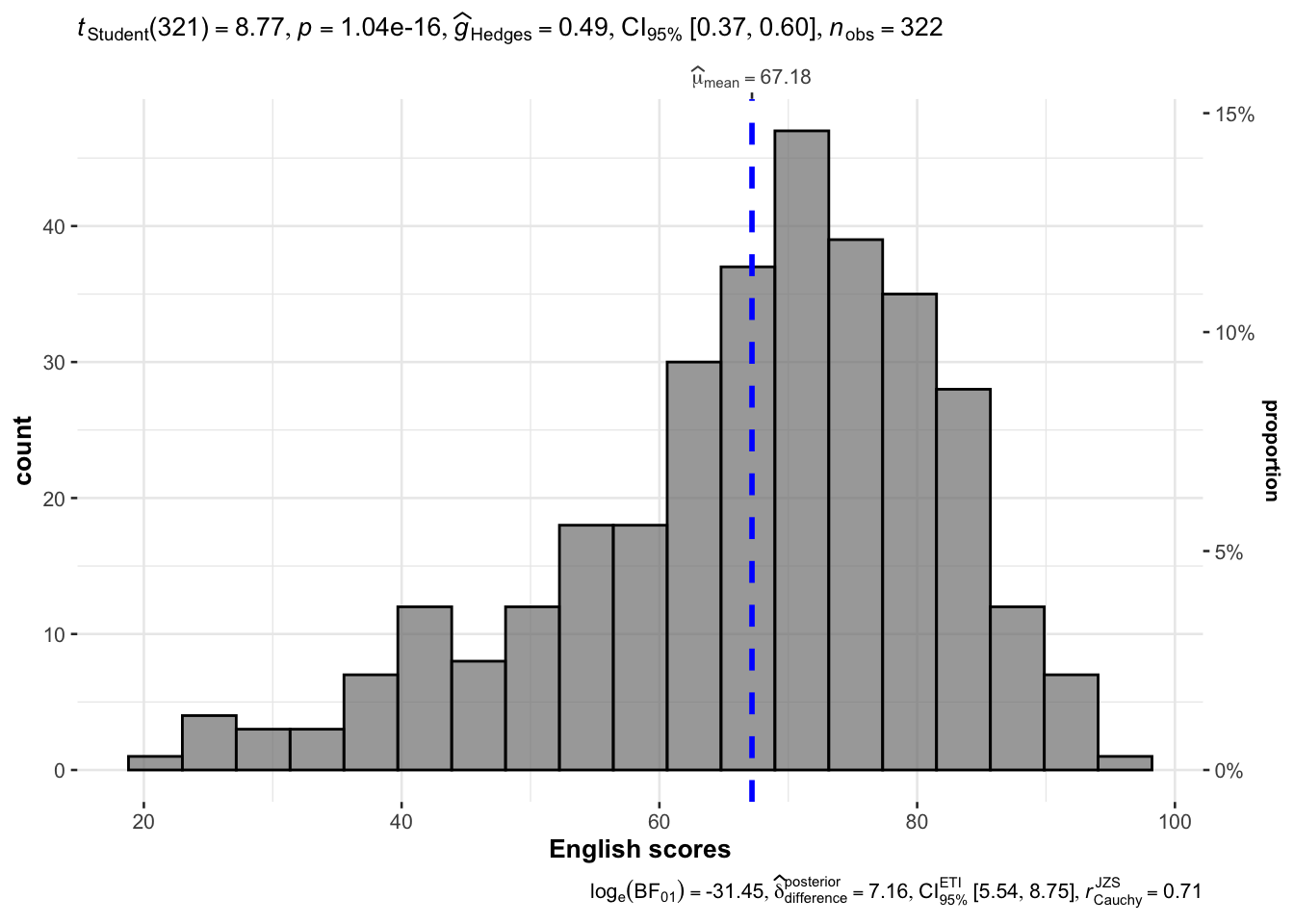
3.1.1 By stats type
It used mean.
gghistostats(
  data = exam_data,
  x = ENGLISH,
  type = "parametric",
  test.value = 60,
  bin.args = list(color = "black",
                  fill = "grey50",
                  alpha = 0.7),
  normal.curve = FALSE,
  normal.curve.args = list(linewidth = 2),
  xlab = "English scores"
)
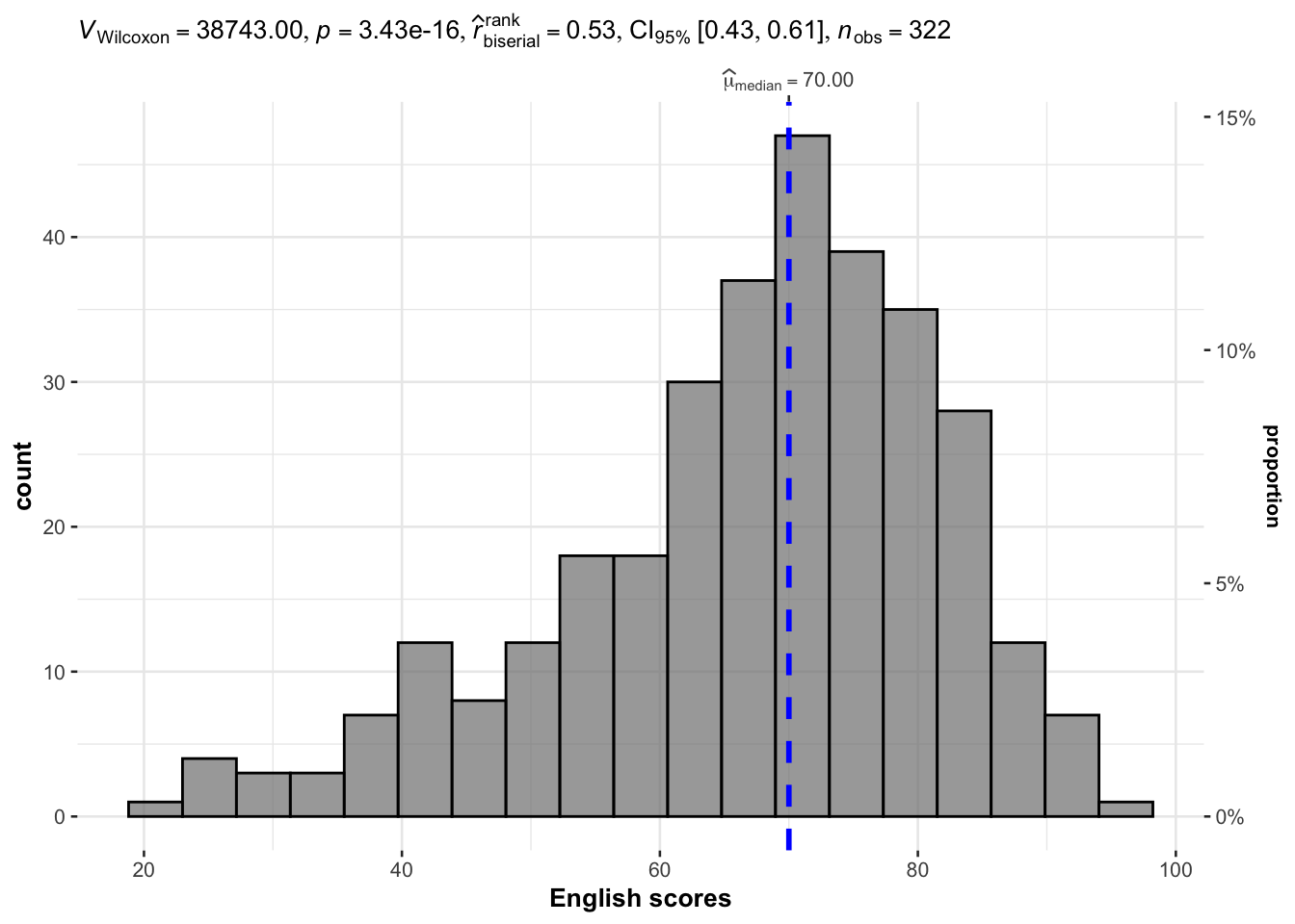
It used median.
gghistostats(
  data = exam_data,
  x = ENGLISH,
  type = "np",
  test.value = 60,
  bin.args = list(color = "black",
                  fill = "grey50",
                  alpha = 0.7),
  normal.curve = FALSE,
  normal.curve.args = list(linewidth = 2),
  xlab = "English scores"
)
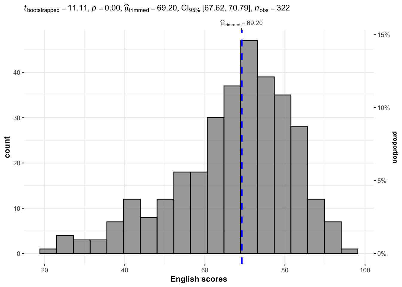
gghistostats(
  data = exam_data,
  x = ENGLISH,
  type = "robust",
  test.value = 60,
  bin.args = list(color = "black",
                  fill = "grey50",
                  alpha = 0.7),
  normal.curve = FALSE,
  normal.curve.args = list(linewidth = 2),
  xlab = "English scores"
)
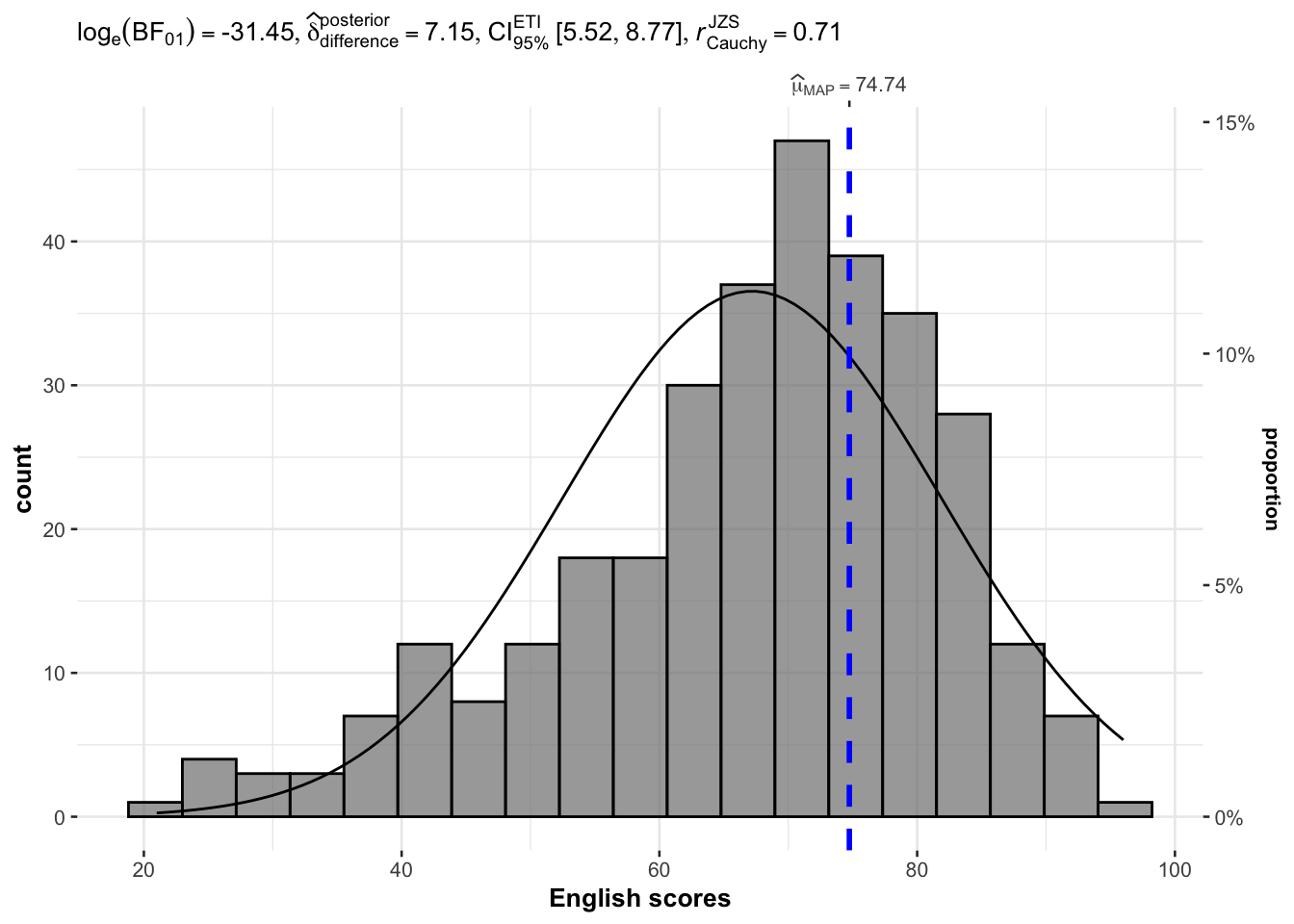
gghistostats(
  data = exam_data,
  x = ENGLISH,
  type = "bayes",
  test.value = 60,
  bin.args = list(color = "black",
                  fill = "grey50",
                  alpha = 0.7),
  normal.curve = FALSE,
  normal.curve.args = list(linewidth = 2),
  xlab = "English scores"
)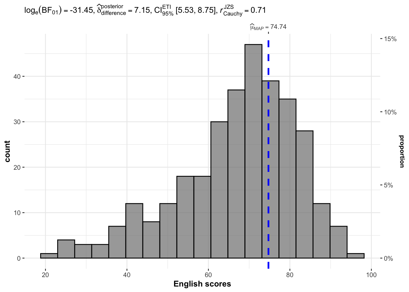
Reference lines default to corresponding mean, median, etc can be controlled by the centrality argument.
3.1.2 Plotting Normal Distribution Curve
Previous plot, by default, do not have the normal distribution curve. Setting normal.curve = TRUE adds the normal distribution curve.
gghistostats(
  data = exam_data,
  x = ENGLISH,
  type = "bayesian",
  test.value = 60,
  bin.args = list(color = "black",
                  fill = "grey50",
                  alpha = 0.7),
  normal.curve = TRUE,
  normal.curve.args = list(linewidth = 0.5),
  xlab = "English scores"
)
3.1.3 Extracting calculated stats
p <- gghistostats(
  data = exam_data,
  x = ENGLISH,
  type = "parametric",
  test.value = 60,
  bin.args = list(
    color = "black",
    fill = "grey50",
    alpha = 0.7
  ),
  normal.curve = FALSE,
  normal.curve.args = list(linewidth = 2),
  xlab = "English scores"
)

extract_stats(p)
$subtitle_data
# A tibble: 1 × 15
mu statistic df.error p.value method alternative effectsize
<dbl> <dbl> <dbl> <dbl> <chr> <chr> <chr>
1 60 8.77 321 1.04e-16 One Sample t-test two.sided Hedges' g
estimate conf.level conf.low conf.high conf.method conf.distribution n.obs
<dbl> <dbl> <dbl> <dbl> <chr> <chr> <int>
1 0.488 0.95 0.372 0.603 ncp t 322
expression
<list>
1 <language>
$caption_data
# A tibble: 1 × 16
term effectsize estimate conf.level conf.low conf.high pd
<chr> <chr> <dbl> <dbl> <dbl> <dbl> <dbl>
1 Difference Bayesian t-test 7.20 0.95 5.48 8.79 1
prior.distribution prior.location prior.scale bf10 method
<chr> <dbl> <dbl> <dbl> <chr>
1 cauchy 0 0.707 4.54e13 Bayesian t-test
conf.method log_e_bf10 n.obs expression
<chr> <dbl> <int> <list>
1 ETI 31.4 322 <language>
$pairwise_comparisons_data
NULL
$descriptive_data
NULL
$one_sample_data
NULL
$tidy_data
NULL
$glance_data
NULL3.2 ggwithinstats
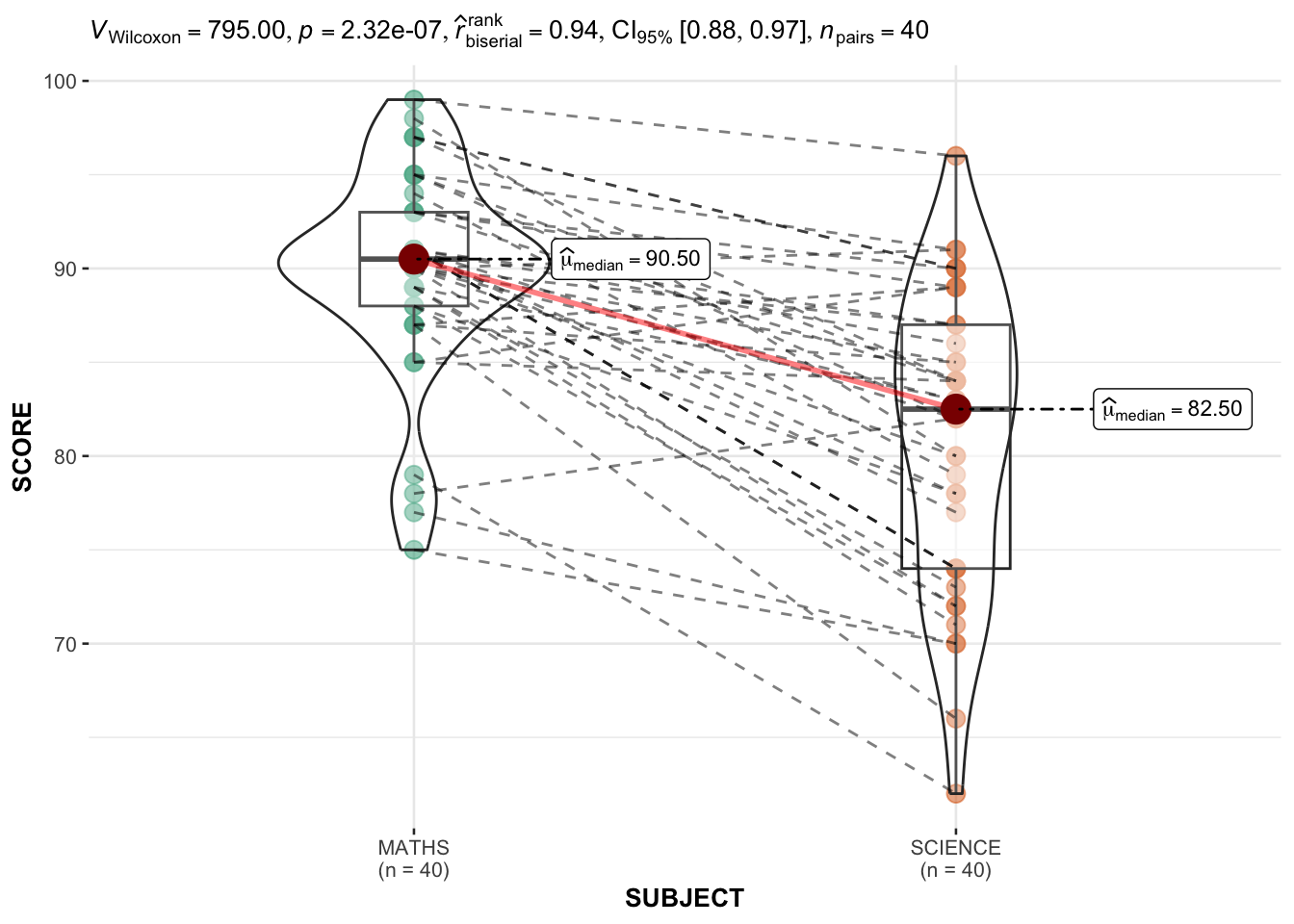
We need to pivot table long to have these columns: ID, SUBJECT, SCORE.
exam_long <-exam_data %>% pivot_longer(
  cols = ENGLISH:SCIENCE,
  names_to = "SUBJECT",
  values_to = "SCORE") %>%
filter(CLASS == "3A")ggwithinstats(
data = filter(exam_long, SUBJECT %in% c("MATHS", "SCIENCE")),
x = SUBJECT,
y = SCORE,
type = "np"
)
3.3 ggscatterstats
The best fit line is controlled by smooth.line.args
ggscatterstats(
  data = exam_data,
  x = MATHS,
  y = ENGLISH,
  marginal = TRUE, # Show the histogram
  label.var = ID,
  label.expression = ENGLISH > 90 & MATHS > 90
)
4 Visualizing Models
performance package is also part of easystats package.
Refer to Hands-on_Ex4A: 4 Model Visualizations