pacman::p_load(seriation, dendextend, heatmaply, tidyverse)Hands-on Exercise 9C: Heatmap for Visualising and Analysing Multivariate Data
1 Overview
This hands-on exercise covers Chapter 14: Heatmap for Visualising and Analysing Multivariate Data.
In this exercise, I learned:
- how to create heatmaps
2 Getting Started
2.1 Loading the required packages
For this exercise we will use the following R packages:
2.2 Importing data
We will the data of World Happines 2018 report. The data set is downloaded from here. The original data set is in Microsoft Excel format. It has been extracted and saved in csv file called WHData-2018.csv.
wh <- read_csv("data/WHData-2018.csv")

glimpse(wh)
Rows: 156
Columns: 12
$ Country <chr> "Albania", "Bosnia and Herzegovina", "B…
$ Region <chr> "Central and Eastern Europe", "Central …
$ `Happiness score` <dbl> 4.586, 5.129, 4.933, 5.321, 6.711, 5.73…
$ `Whisker-high` <dbl> 4.695, 5.224, 5.022, 5.398, 6.783, 5.81…
$ `Whisker-low` <dbl> 4.477, 5.035, 4.844, 5.244, 6.639, 5.66…
$ Dystopia <dbl> 1.462, 1.883, 1.219, 1.769, 2.494, 1.45…
$ `GDP per capita` <dbl> 0.916, 0.915, 1.054, 1.115, 1.233, 1.20…
$ `Social support` <dbl> 0.817, 1.078, 1.515, 1.161, 1.489, 1.53…
$ `Healthy life expectancy` <dbl> 0.790, 0.758, 0.712, 0.737, 0.854, 0.73…
$ `Freedom to make life choices` <dbl> 0.419, 0.280, 0.359, 0.380, 0.543, 0.55…
$ Generosity <dbl> 0.149, 0.216, 0.064, 0.120, 0.064, 0.08…
$ `Perceptions of corruption` <dbl> 0.032, 0.000, 0.009, 0.039, 0.034, 0.17…3 Data Preparation
3.1 Changing row names to country names
row.names(wh) <- wh$Country3.2 Transforming data frame into a matrix
wh1 <- dplyr::select(wh, c(3, 7:12))
wh_matrix <- data.matrix(wh)
4 Static Heatmap
In this section, we will heatmap() of R Stats package to plot heatmaps.
4.1 heatmap() of R Stats
wh_heatmap <- heatmap(wh_matrix,
                      Rowv=NA, Colv=NA)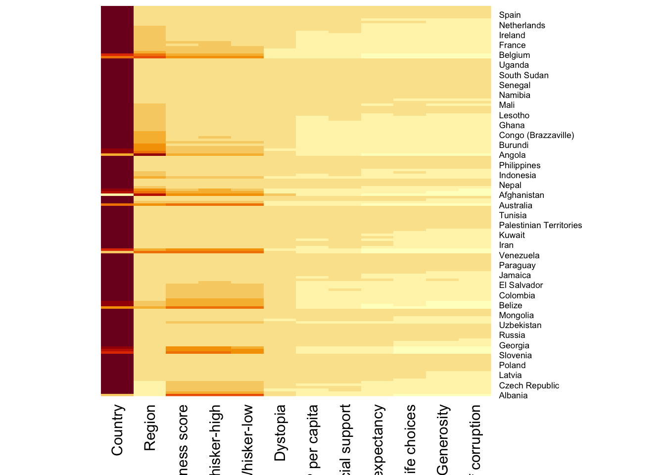
When Rowv and Colv are not NA, dendograms are plotted
wh_heatmap <- heatmap(wh_matrix)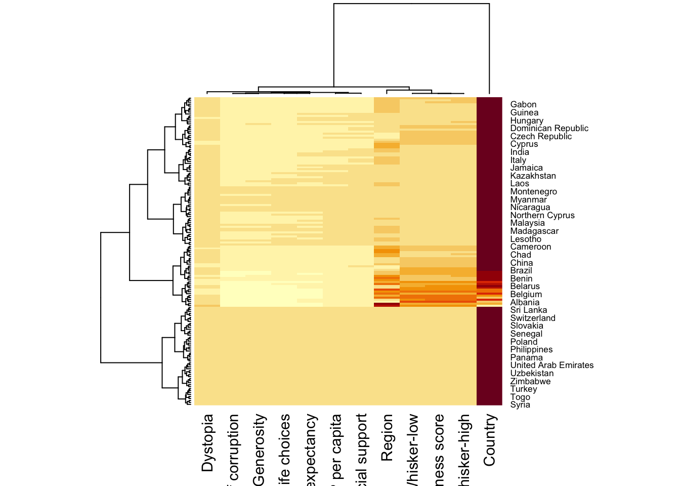
wh_heatmap <- heatmap(wh_matrix,
                      scale="column",
                      cexRow = 0.6,
                      cexCol = 0.8,
                      margins = c(10, 4))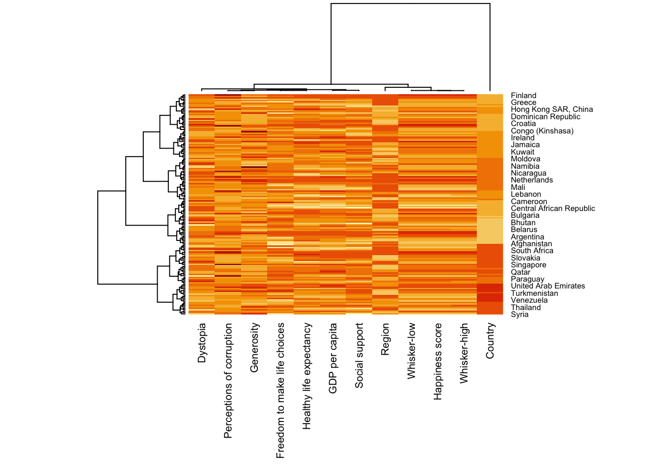
5 Creating interactive heatmap
We will use heatmaply to generate interactive heatmaps.
5.1 Working with heatmaply
heatmaply(mtcars)Let’s also plot the Happiness interactive heatmap
heatmaply(wh_matrix[, -c(1, 2, 4, 5)])5.2 Data transformation
5.2.1 Scaling method
heatmaply(wh_matrix[, -c(1, 2, 4, 5)],
          scale = "column")
5.2.2 Normalizing method
This will transform based on 0 to 1 scale of a normal distribution
heatmaply(normalize(wh_matrix[, -c(1, 2, 4, 5)]))5.2.3 Percentizing
This will rank the values and visualize based on percentile
heatmaply(percentize(wh_matrix[, -c(1, 2, 4, 5)]))5.3 Clustering Algorithm
heatmaply supports a variety of hierarchical clustering algorithm. The main arguments provided are:
distfun: function used to compute the distance (dissimilarity) between both rows and columns. Defaults to dist. The options “pearson”, “spearman” and “kendall” can be used to use correlation-based clustering, which uses as.dist(1 - cor(t(x))) as the distance metric (using the specified correlation method).
hclustfun: function used to compute the hierarchical clustering when Rowv or Colv are not dendrograms. Defaults to hclust.
dist_method default is NULL, which results in “euclidean” to be used. It can accept alternative character strings indicating the method to be passed to distfun. By default distfun is “dist”” hence this can be one of “euclidean”, “maximum”, “manhattan”, “canberra”, “binary” or “minkowski”.
hclust_method default is NULL, which results in “complete” method to be used. It can accept alternative character strings indicating the method to be passed to hclustfun. By default hclustfun is hclust hence this can be one of “ward.D”, “ward.D2”, “single”, “complete”, “average” (= UPGMA), “mcquitty” (= WPGMA), “median” (= WPGMC) or “centroid” (= UPGMC).
In general, a clustering model can be calibrated either manually or statistically.
5.3.1 Manual Approach
Plot using heirarchical clustering algorithm with “Euclidean distance” and “ward.D” method.
heatmaply(normalize(wh_matrix[, -c(1, 2, 4, 5)]),
          dist_method = "euclidean",
          hclust_method = "ward.D")
5.3.2 Statistical Approach
We will first determine the appropriate clustering method to use.
wh_d <- dist(normalize(wh_matrix[, -c(1, 2, 4, 5)]), method = "euclidean")
dend_expend(wh_d)[[3]]
dist_methods hclust_methods optim
1 unknown ward.D 0.6137851
2 unknown ward.D2 0.6289186
3 unknown single 0.4774362
4 unknown complete 0.6434009
5 unknown average 0.6701688
6 unknown mcquitty 0.5020102
7 unknown median 0.5901833
8 unknown centroid 0.6338734find_k() will be used to determine the optimal number of the cluster.
wh_clust <- hclust(wh_d, method = "average")
num_k <- find_k(wh_clust)
plot(num_k)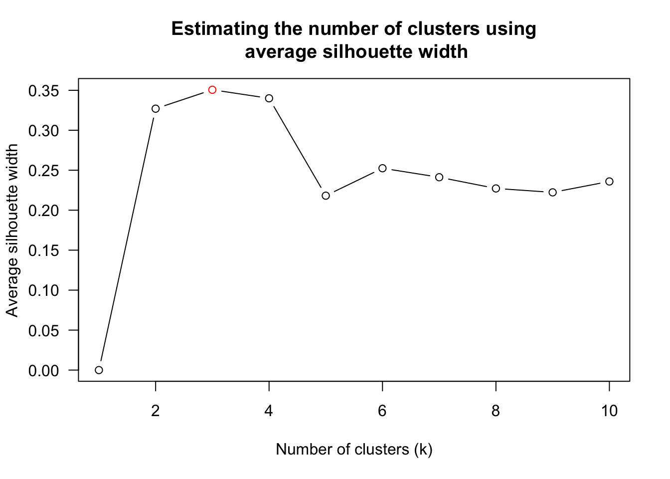
heatmaply(normalize(wh_matrix[, -c(1, 2, 4, 5)]),
          dist_method = "euclidean",
          hclust_method = "average",
          k_row = 3)
5.4 Seriation
Seriation will give the optimal branch ordering of the dendogram. Hierarchical clustering only provides limitations in the ordering. If clustering them gives you ((A+B)+C) as a tree, you know that C can’t end up between A and B, but it doesn’t tell you which way to flip the A+B cluster.
We will explore the different seriation algorithms
heatmaply(normalize(wh_matrix[, -c(1, 2, 4, 5)]),
          seriate = "OLO")
The OLO seriation algorithm has \(O(n^4)\) complexity so it is slow.
Another option is “GW” (Gruvaeus and Wainer) which aims for the same goal as OLO but uses a potentially faster heuristic.
heatmaply(normalize(wh_matrix[, -c(1, 2, 4, 5)]),
          seriate = "GW")
The option “mean” gives the output we would get by default from heatmap functions in other packages such as gplots::heatmap.2.
heatmaply(normalize(wh_matrix[, -c(1, 2, 4, 5)]),
          seriate = "mean")
The none option does not perform any rotations in the dendogram.
heatmaply(normalize(wh_matrix[, -c(1, 2, 4, 5)]),
          seriate = "none")
6 Working with color palettes
The default colour palette uses by heatmaply is viridis. heatmaply users, however, can use other colour palettes in order to improve the aestheticness and visual friendliness of the heatmap.
Let’s try another color palette.
heatmaply(normalize(wh_matrix[, -c(1, 2, 4, 5)]),
          seriate = "none",
          colors = Blues)
7 Adding finishing touches
We can improve the quality of the visualization by using heatmaply’s parameters.
The following are used:
- k_row is used to produce 5 groups.
- margins is used to change the top margin to 60 and row margin to 200.
- fontsizw_row and fontsize_col are used to change the font size for row and column labels to 4.
- main is used to write the main title of the plot.
- xlab and ylab are used to write the x-axis and y-axis labels respectively.
heatmaply(normalize(wh_matrix[, -c(1, 2, 4, 5)]),
          Colv=NA,
          seriate = "none",
          colors = Blues,
          k_row = 5,
          margins = c(NA,200,60,NA),
          fontsize_row = 4,
          fontsize_col = 5,
          main="World Happiness Score and Variables by Country, 2018 \nDataTransformation using Normalise Method",
          xlab = "World Happiness Indicators",
          ylab = "World Countries"
          )
8 Reflections
My impression of heatmaps are just a group of cells with different column representing a single value (e.g. weekly traffic graph).
In this exercise I learned that we can use it to visualize multiple variables and also that dendograms are part of it.