pacman::p_load(tidyverse, FunnelPlotR, plotly, knitr)Hands-on Exercise 4C: Building Funnel Plot with R
1 Overview
This hands-on exercise covers Chapter 12: Funnel Plots for Fair Comparisons.
I learned about the following:
- generating funnel plots
2 Getting Started
2.1 Loading the required packages
For this exercise we will use the following R packages:
readr for importing csv into R.
FunnelPlotR for creating funnel plot.
ggplot2 for creating funnel plot manually.
knitr for building static html table.
plotly for creating interactive funnel plot.
2.2 Loading the data
In this section, COVID-19_DKI_Jakarta will be used. The data was downloaded from Open Data Covid-19 Provinsi DKI Jakarta portal. For this hands-on exercise, we are going to compare the cumulative COVID-19 cases and death by sub-district (i.e. kelurahan) as at 31st July 2021, DKI Jakarta.
The code chunk below imports the data into R and save it into a tibble data frame object called covid19.
covid19 <- read_csv("data/COVID-19_DKI_Jakarta.csv") %>%
  mutate_if(is.character, as.factor)

kable(head(covid19, 10))| Sub-district ID | City | District | Sub-district | Positive | Recovered | Death |
|---|---|---|---|---|---|---|
| 3172051003 | JAKARTA UTARA | PADEMANGAN | ANCOL | 1776 | 1691 | 26 |
| 3173041007 | JAKARTA BARAT | TAMBORA | ANGKE | 1783 | 1720 | 29 |
| 3175041005 | JAKARTA TIMUR | KRAMAT JATI | BALE KAMBANG | 2049 | 1964 | 31 |
| 3175031003 | JAKARTA TIMUR | JATINEGARA | BALI MESTER | 827 | 797 | 13 |
| 3175101006 | JAKARTA TIMUR | CIPAYUNG | BAMBU APUS | 2866 | 2792 | 27 |
| 3174031002 | JAKARTA SELATAN | MAMPANG PRAPATAN | BANGKA | 1828 | 1757 | 26 |
| 3175051002 | JAKARTA TIMUR | PASAR REBO | BARU | 2541 | 2433 | 37 |
| 3175041004 | JAKARTA TIMUR | KRAMAT JATI | BATU AMPAR | 3608 | 3445 | 68 |
| 3171071002 | JAKARTA PUSAT | TANAH ABANG | BENDUNGAN HILIR | 2012 | 1937 | 38 |
| 3175031002 | JAKARTA TIMUR | JATINEGARA | BIDARA CINA | 2900 | 2773 | 52 |
3 FunnelPlotR methods
FunnelPlotR package uses ggplot to generate funnel plots. It requires a numerator (events of interest), denominator (population to be considered) and group. The key arguments selected for customisation are:
limit: plot limits (95 or 99).label_outliers: to label outliers (true or false).Poisson_limits: to add Poisson limits to the plot.OD_adjust: to add overdispersed limits to the plot.xrangeandyrange: to specify the range to display for axes, acts like a zoom function.Other aesthetic components such as graph title, axis labels etc.
3.1 Basic Plot
The code chunk below plots a funnel plot.
funnel_plot(
  .data = covid19,
  numerator = Positive,
  denominator = Death,
  group = `Sub-district`
)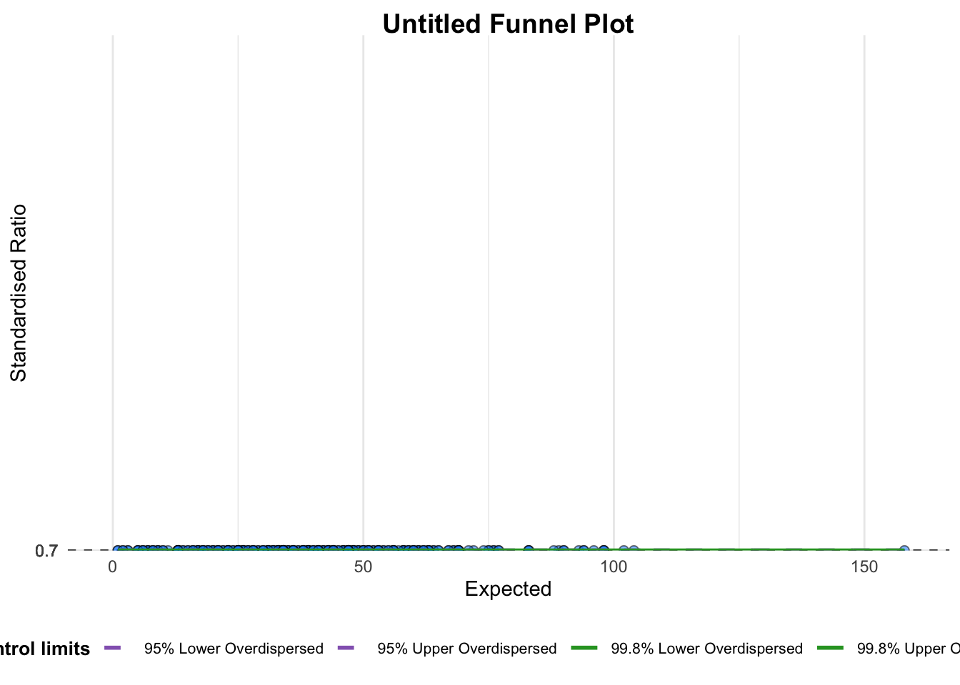
A funnel plot object with 267 points of which 0 are outliers.
Plot is adjusted for overdispersion.
Things to learn from the code chunk above.
groupin this function is different from the scatterplot. Here, it defines the level of the points to be plotted i.e. Sub-district, District or City. If Cityc is chosen, there are only six data points.By default,
data_typeargument is “SR”.limit: Plot limits, accepted values are: 95 or 99, corresponding to 95% or 99.8% quantiles of the distribution.
3.2 Makeover 1
From the plot above, the values are really low so we will adjust the range of y-axis, along with changing the data_type from the default “SR” (indirectly standardised ratios) to “PR” (proportions).
funnel_plot(
  .data = covid19,
  numerator = Death,
  denominator = Positive,
  group = `Sub-district`,
  data_type = "PR",
  x_range = c(0, 6500),
  y_range = c(0, 0.05)
)
3.3 Makeover 2
funnel_plot(
  .data = covid19,
  numerator = Death,
  denominator = Positive,
  group = `Sub-district`,
  data_type = "PR",
  xrange = c(0, 6500),
  yrange = c(0, 0.05),
  label = NA,
  title = "Cumulative COVID-19 Fatality Rate by Cumulative Total Number of COVID-19 Positive Cases", #<<
  x_label = "Cumulative COVID-19 Positive Cases", #<<
  y_label = "Cumulative Fatality Rate"  #<<
)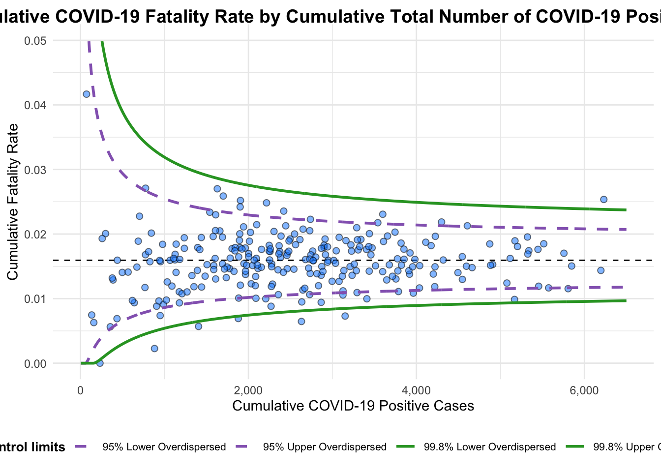
A funnel plot object with 267 points of which 7 are outliers.
Plot is adjusted for overdispersion.
Things to learn from the code chunk above.
label = NAargument is to remove the default label outliers feature.titleargument is used to add plot title.x_labelandy_labelarguments are used to add/edit x-axis and y-axis titles.
4 Funnel Plot for Fair Visual Comparison: ggplot2 methods
In this section, we will learn how to generate a funnel plot manually with ggplot2.
4.1 Computing the basic derived fields
To plot the funnel plot from scratch, we need to derive cumulative death rate and standard error of cumulative death rate.
df <- covid19 %>%
  mutate(rate = Death / Positive) %>%
  mutate(rate.se = sqrt((rate*(1-rate)) / (Positive))) %>%
filter(rate > 0)Next, the fit.mean is computed by using the code chunk below.
fit.mean <- weighted.mean(df$rate, 1/df$rate.se^2)4.2 Calculate lower and upper limits for 95% and 99.9% CI
The code chunk below is used to compute the lower and upper limits for 95% confidence interval.
number.seq <- seq(1, max(df$Positive), 1)
number.ll95 <- fit.mean - 1.96 * sqrt((fit.mean*(1-fit.mean)) / (number.seq))
number.ul95 <- fit.mean + 1.96 * sqrt((fit.mean*(1-fit.mean)) / (number.seq))
number.ll999 <- fit.mean - 3.29 * sqrt((fit.mean*(1-fit.mean)) / (number.seq))
number.ul999 <- fit.mean + 3.29 * sqrt((fit.mean*(1-fit.mean)) / (number.seq))
dfCI <- data.frame(number.ll95, number.ul95, number.ll999,
                   number.ul999, number.seq, fit.mean)
4.3 Plotting a static funnel plot
Show the code
p <- ggplot(df, aes(x = Positive, y = rate)) +
  geom_point(aes(label=`Sub-district`),
             alpha=0.4) +
  geom_line(data = dfCI,
            aes(x = number.seq,
                y = number.ll95),
            size = 0.4,
            colour = "grey40",
            linetype = "dashed") +
  geom_line(data = dfCI,
            aes(x = number.seq,
                y = number.ul95),
            size = 0.4,
            colour = "grey40",
            linetype = "dashed") +
  geom_line(data = dfCI,
            aes(x = number.seq,
                y = number.ll999),
            size = 0.4,
            colour = "grey40") +
  geom_line(data = dfCI,
            aes(x = number.seq,
                y = number.ul999),
            size = 0.4,
            colour = "grey40") +
  geom_hline(data = dfCI,
             aes(yintercept = fit.mean),
             size = 0.4,
             colour = "grey40") +
  coord_cartesian(ylim=c(0,0.05)) +
  annotate("text", x = 1, y = -0.13, label = "95%", size = 3, colour = "grey40") +
  annotate("text", x = 4.5, y = -0.18, label = "99%", size = 3, colour = "grey40") +
  ggtitle("Cumulative Fatality Rate by Cumulative Number of COVID-19 Cases") +
  xlab("Cumulative Number of COVID-19 Cases") +
  ylab("Cumulative Fatality Rate") +
  theme_light() +
  theme(plot.title = element_text(size=12),
        legend.position = c(0.91,0.85),
        legend.title = element_text(size=7),
        legend.text = element_text(size=7),
        legend.background = element_rect(colour = "grey60", linetype = "dotted"),
        legend.key.height = unit(0.3, "cm"))
p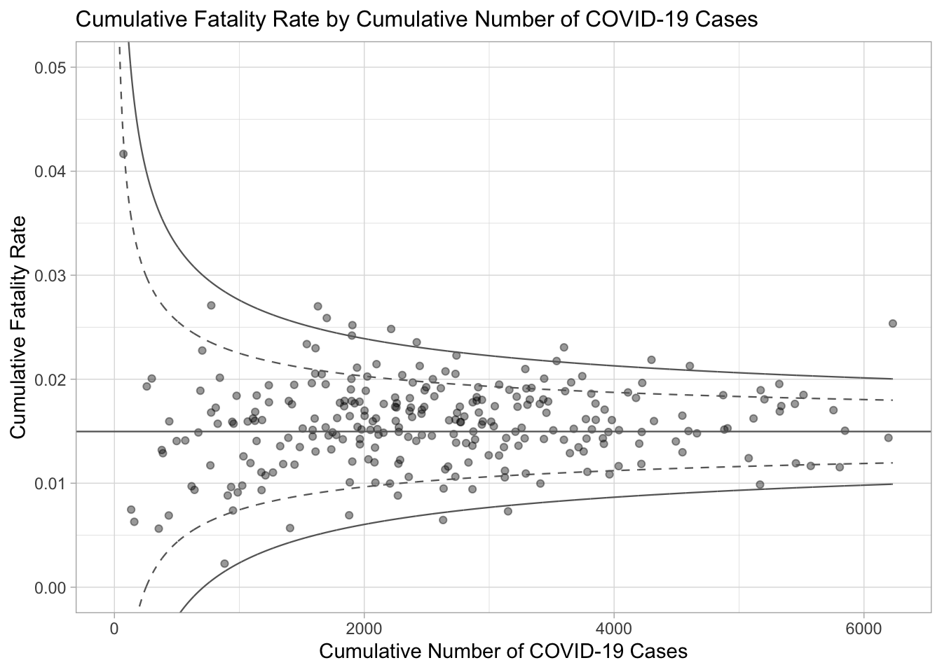
4.4 Interactive plot with plotly
The funnel plot created using ggplot2 functions can be made interactive with ggplotly() of plotly r package.
fp_ggplotly <- ggplotly(p,
  tooltip = c("label",
              "x",
              "y"))
fp_ggplotly
5 Reflections
Initially, I thought the term “funnel plot” refers to the tool usually used for marketing analysis or for UX research which is usually used to know how many customers or users drop off in each step of the process. This plot is used in process analysis as well.
This is why I was confused at first about the funnel plot in this exercise as it is quite different from what I know. In the use case of this exercise, the purpose of the funnel plot is to help identify for which sub-districts in Jakarta are Covid-19 deaths relatively extreme compared to the other sub-districts. With this knowledge, public health officials can allocate their limited resources accordingly to address the situation in these sub-districts.