pacman::p_load(GGally, parallelPlot, tidyverse)Hands-on Exercise 9D: Visual Multivariate Analysis with Parallel Coordinates Plot
1 Overview
This hands-on exercise covers Chapter 15: Visual Multivariate Analysis with Parallel Coordinates Plot.
In this exercise, I learned:
- Doing multivariate analysis with parallel coordinates
2 Getting Started
2.1 Loading the required packages
For this exercise we will use the following R packages:
2.2 Importing data
We will the data of World Happines 2018 report. The data set is downloaded from here. The original data set is in Microsoft Excel format. It has been extracted and saved in csv file called WHData-2018.csv.
wh <- read_csv("data/WHData-2018.csv")

glimpse(wh)
Rows: 156
Columns: 12
$ Country <chr> "Albania", "Bosnia and Herzegovina", "B…
$ Region <chr> "Central and Eastern Europe", "Central …
$ `Happiness score` <dbl> 4.586, 5.129, 4.933, 5.321, 6.711, 5.73…
$ `Whisker-high` <dbl> 4.695, 5.224, 5.022, 5.398, 6.783, 5.81…
$ `Whisker-low` <dbl> 4.477, 5.035, 4.844, 5.244, 6.639, 5.66…
$ Dystopia <dbl> 1.462, 1.883, 1.219, 1.769, 2.494, 1.45…
$ `GDP per capita` <dbl> 0.916, 0.915, 1.054, 1.115, 1.233, 1.20…
$ `Social support` <dbl> 0.817, 1.078, 1.515, 1.161, 1.489, 1.53…
$ `Healthy life expectancy` <dbl> 0.790, 0.758, 0.712, 0.737, 0.854, 0.73…
$ `Freedom to make life choices` <dbl> 0.419, 0.280, 0.359, 0.380, 0.543, 0.55…
$ Generosity <dbl> 0.149, 0.216, 0.064, 0.120, 0.064, 0.08…
$ `Perceptions of corruption` <dbl> 0.032, 0.000, 0.009, 0.039, 0.034, 0.17…3 Plotting Static Parallel Coordinates Plots
We will use ggparcoord() to generate parallel coordinates plots.
3.1 Plotting simple parallel coordinates
ggparcoord(data = wh,
           columns = c(7:12))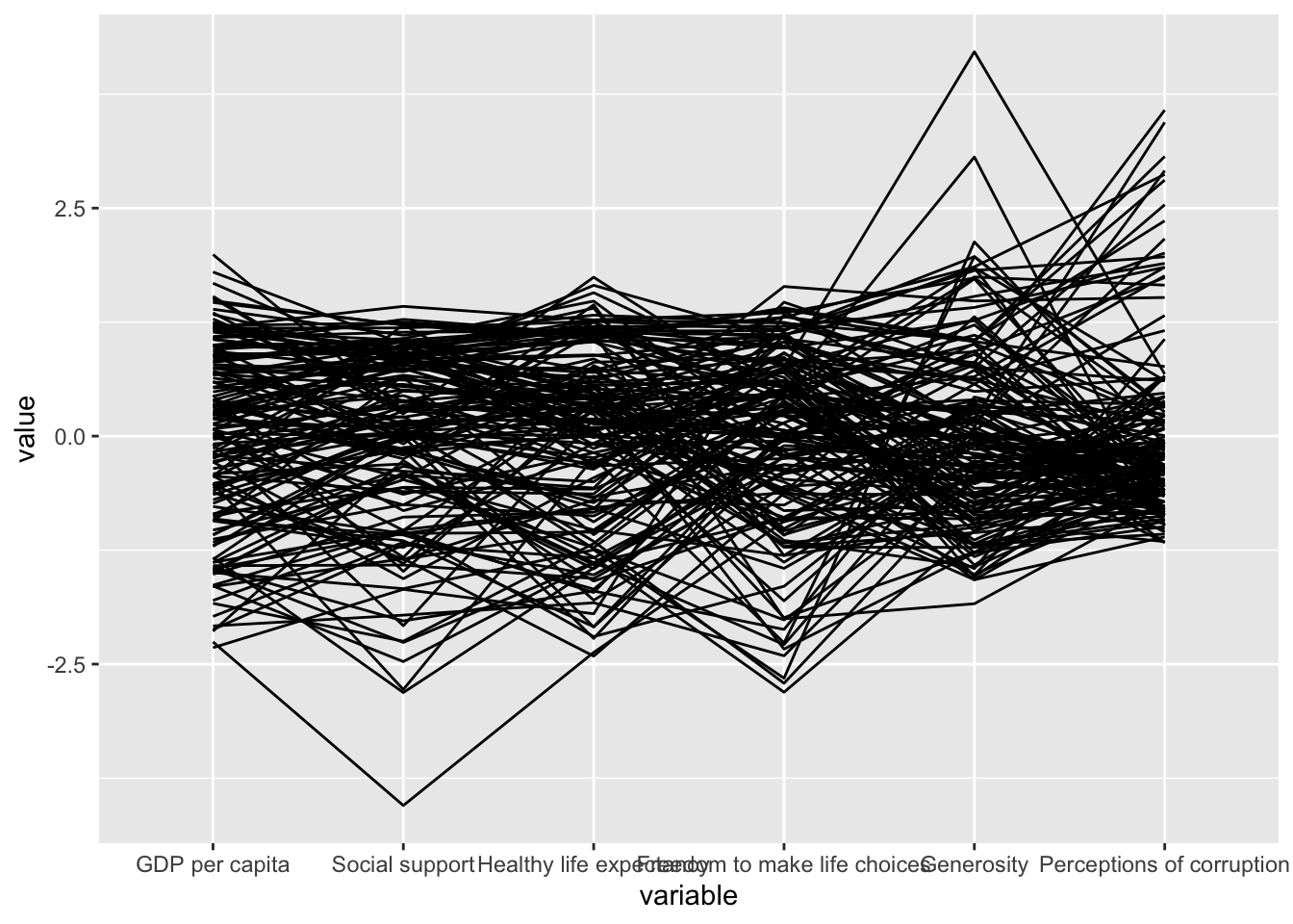
3.2 Plotting simple parallel coordinates with boxplot
Adding boxplot will reveal information about the distribution of the values.
ggparcoord(data = wh,
           columns = c(7:12),
           groupColumn = 2,
           scale = "uniminmax",
           alphaLines = 0.2,
           boxplot = TRUE,
           title = "Parallel Coordinates Plot of World Happines Variables")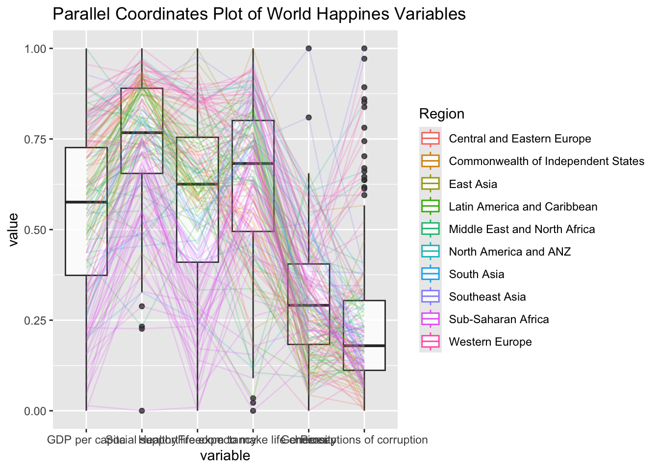
This generates values of for each region
3.3 Parallel coordinates with facets
ggparcoord(data = wh,
           columns = c(7:12),
           groupColumn = 2,
           scale = "uniminmax",
           alphaLines = 0.2,
           boxplot = TRUE,
           title = "Multiple Parallel Coordinates Plots of World Happines Variables by Region") +
  facet_wrap(~ Region)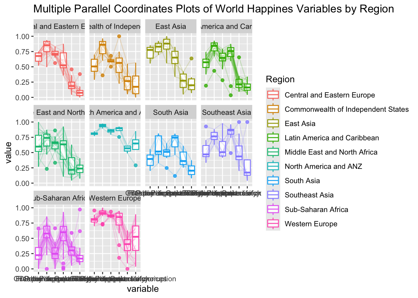
3.4 Adjusting the x-axis labels
The x-axis labels overlap and are hard to read.
ggparcoord(data = wh,
           columns = c(7:12),
           groupColumn = 2,
           scale = "uniminmax",
           alphaLines = 0.2,
           boxplot = TRUE,
           title = "Multiple Parallel Coordinates Plots of World Happines Variables by Region") +
  facet_wrap(~ Region) +
  theme(axis.text.x = element_text(angle = 30, hjust=1))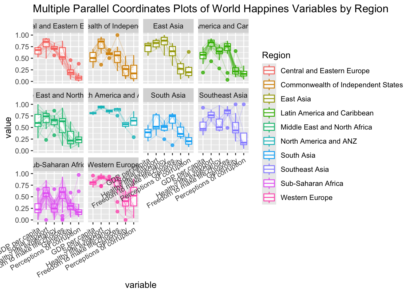
4 Plotting Interactive Parallel Plots
parallelPlot is an R package specially designed to plot a parallel coordinates plot by using ‘htmlwidgets’ package and d3.js. In this section, you will learn how to use functions provided in parallelPlot package to build interactive parallel coordinates plot.
4.1 The Basic Plot
wh <- wh %>%
  select("Happiness score", c(7:12))
parallelPlot(wh,
             width = 320,
             height = 250)
4.2 Rotate axis label
The axis labels overlap and are hard to read. We will use rotateTitle to avoid overlapping axis labels.
parallelPlot(wh,
             rotateTitle = TRUE)
4.3 Changing the color scheme
We can also change the color scheme
parallelPlot(wh,
             continuousCS = "YlOrRd",
             rotateTitle = TRUE)
4.4 Parallel coordinates plot with histogram
In the code chunk below, histoVisibility argument is used to plot histogram along the axis of each variables.
histoVisibility <- rep(TRUE, ncol(wh))
parallelPlot(wh,
             rotateTitle = TRUE,
             histoVisibility = histoVisibility)
5 Reflections
I understand that this technique is used to visualize multiple variables across many context (e.g., region).
However, its clarity and aesthetics both are on the low end as presented in the exercise, mainly due to the sheer amount of dimensions presented.
Adding a country label when hovering on a line should already improve the clarity.
For multivariate analysis, I prefer to use heatmap as it’s more aesthetic and clearer.