pacman::p_load(lubridate, ggthemes, reactable,
reactablefmtr, gt, gtExtras, tidyverse, svglite)Hands-on Exercise 10: Information Dashboard Design: R methods
1 Overview
This hands-on exercise covers Chapter 31: Information Dashboard Design: R methods.
In this exercise, I learned:
- Building dashboard
2 Getting Started
2.1 Loading the required packages
For this exercise we will use the following R packages:
Packages added
svglite- when plotting bullet chart withgt.
2.2 Importing data
For the purpose of this study, we will import RDS file CofeeChain.rds.
coffeechain <- read_rds("data/rds/CoffeeChain.rds")2.3 Exporting to CSV
.mdb not working on Mac
As .mdb does not work on Mac, I exported the data to CSV to make it work with Tableau
write.csv(coffeechain,"data/CoffeeChain.csv")3 Plotting with ggplot
3.1 Bullet chart
We will aggregate Sales and Budgeted Sales at the Product level.
product <- coffeechain %>%
  group_by(`Product`) %>%
  summarise(`target` = sum(`Budget Sales`),
            `current` = sum(`Sales`)) %>%
  ungroup()
Plot using ggplot
ggplot(product, aes(Product, current)) +
  geom_col(aes(Product, max(target) * 1.01),
           fill="grey85", width=0.85) +
  geom_col(aes(Product, target * 0.75),
           fill="grey60", width=0.85) +
  geom_col(aes(Product, target * 0.5),
           fill="grey50", width=0.85) +
  geom_col(aes(Product, current),
           width=0.35,
           fill = "black") +
  geom_errorbar(aes(y = target,
                    x = Product,
                    ymin = target,
                    ymax= target),
                width = .4,
                colour = "red",
                size = 1) +
  coord_flip()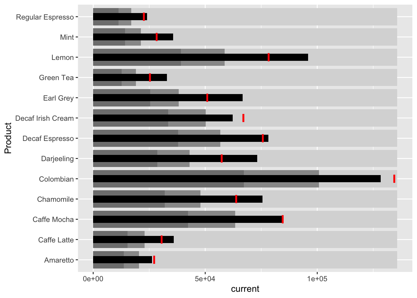
3.2 Plotting sparklines
3.2.1 Preparing data
Generate the sales report
sales_report <- coffeechain %>%
  filter(Date >= "2013-01-01") %>%
  mutate(Month = month(Date)) %>%
  group_by(Month, Product) %>%
  summarise(Sales = sum(Sales)) %>%
  ungroup() %>%
  select(Month, Product, Sales)
Compute the minimum, maximum and end of month sales
mins <- group_by(sales_report, Product) %>%
  slice(which.min(Sales))
maxs <- group_by(sales_report, Product) %>%
  slice(which.max(Sales))
ends <- group_by(sales_report, Product) %>%
  filter(Month == max(Month))
Compute 25th and 75th quantiles
quarts <- sales_report %>%
  group_by(Product) %>%
  summarise(quart1 = quantile(Sales,
                              0.25),
            quart2 = quantile(Sales,
                              0.75)) %>%
  right_join(sales_report)
3.2.2 Generating chart
ggplot(sales_report, aes(x=Month, y=Sales)) +
  facet_grid(Product ~ ., scales = "free_y") +
  geom_ribbon(data = quarts, aes(ymin = quart1, max = quart2),
              fill = 'grey90') +
  geom_line(size=0.3) +
  geom_point(data = mins, col = 'red') +
  geom_point(data = maxs, col = 'blue') +
  geom_text(data = mins, aes(label = Sales), vjust = -1) +
  geom_text(data = maxs, aes(label = Sales), vjust = 2.5) +
  geom_text(data = ends, aes(label = Sales), hjust = 0, nudge_x = 0.5) +
  geom_text(data = ends, aes(label = Product), hjust = 0, nudge_x = 1.0) +
  expand_limits(x = max(sales_report$Month) +
                  (0.25 * (max(sales_report$Month) - min(sales_report$Month)))) +
  scale_x_continuous(breaks = seq(1, 12, 1)) +
  scale_y_continuous(expand = c(0.1, 0)) +
  theme_tufte(base_size = 3, base_family = "Helvetica") +
  theme(axis.title=element_blank(), axis.text.y = element_blank(),
        axis.ticks = element_blank(), strip.text = element_blank())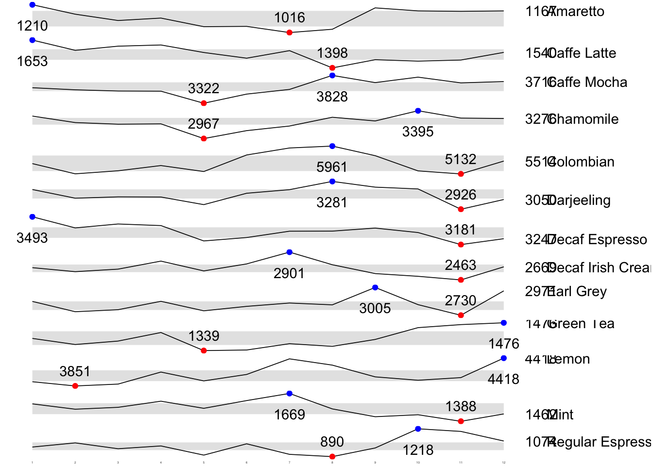
4 Static Information Dashboard Design: gt and gtExtras methods
We will create a static information dashboard using gt and gtExtras.
4.1 Bullet chart
Packages added
Added svglite so the plot can be generated.
We will now plot the chart using gt.
product %>%
  gt::gt() %>%
  gt_plt_bullet(column = current,
              target = target,
              width = 60,
              palette = c("lightblue",
                          "black")) %>%
gt_theme_538()| Product | current |
|---|---|
| Amaretto | |
| Caffe Latte | |
| Caffe Mocha | |
| Chamomile | |
| Colombian | |
| Darjeeling | |
| Decaf Espresso | |
| Decaf Irish Cream | |
| Earl Grey | |
| Green Tea | |
| Lemon | |
| Mint | |
| Regular Espresso |
4.2 Sparklines using gtExtras
4.2.1 Preparing sales data
report <- coffeechain %>%
  mutate(Year = year(Date)) %>%
  filter(Year == "2013") %>%
  mutate (Month = month(Date,
                        label = TRUE,
                        abbr = TRUE)) %>%
  group_by(Product, Month) %>%
  summarise(Sales = sum(Sales)) %>%
  ungroup()

head(report)
# A tibble: 6 × 3
Product Month Sales
<chr> <ord> <dbl>
1 Amaretto Jan 1210
2 Amaretto Feb 1144
3 Amaretto Mar 1100
4 Amaretto Apr 1117
5 Amaretto May 1057
6 Amaretto Jun 1059We need a list type for the sales column so we need to further process the data.
report %>%
  group_by(Product) %>%
  summarize('Monthly Sales' = list(Sales), .groups = "drop")
# A tibble: 13 × 2
Product `Monthly Sales`
<chr> <list>
1 Amaretto <dbl [12]>
2 Caffe Latte <dbl [12]>
3 Caffe Mocha <dbl [12]>
4 Chamomile <dbl [12]>
5 Colombian <dbl [12]>
6 Darjeeling <dbl [12]>
7 Decaf Espresso <dbl [12]>
8 Decaf Irish Cream <dbl [12]>
9 Earl Grey <dbl [12]>
10 Green Tea <dbl [12]>
11 Lemon <dbl [12]>
12 Mint <dbl [12]>
13 Regular Espresso <dbl [12]> 4.2.2 Plotting sparklines
report %>%
  group_by(Product) %>%
  summarize('Monthly Sales' = list(Sales),
            .groups = "drop") %>%
   gt() %>%
   gt_plt_sparkline('Monthly Sales',
same_limit = FALSE)| Product | Monthly Sales |
|---|---|
| Amaretto | |
| Caffe Latte | |
| Caffe Mocha | |
| Chamomile | |
| Colombian | |
| Darjeeling | |
| Decaf Espresso | |
| Decaf Irish Cream | |
| Earl Grey | |
| Green Tea | |
| Lemon | |
| Mint | |
| Regular Espresso |
4.2.3 Calculating statistics
We will generate statistics to add to the plot.
report %>%
  group_by(Product) %>%
  summarise("Min" = min(Sales, na.rm = T),
            "Max" = max(Sales, na.rm = T),
            "Average" = mean(Sales, na.rm = T)
            ) %>%
  gt() %>%
  fmt_number(columns = 4,
decimals = 2)| Product | Min | Max | Average |
|---|---|---|---|
| Amaretto | 1016 | 1210 | 1,119.00 |
| Caffe Latte | 1398 | 1653 | 1,528.33 |
| Caffe Mocha | 3322 | 3828 | 3,613.92 |
| Chamomile | 2967 | 3395 | 3,217.42 |
| Colombian | 5132 | 5961 | 5,457.25 |
| Darjeeling | 2926 | 3281 | 3,112.67 |
| Decaf Espresso | 3181 | 3493 | 3,326.83 |
| Decaf Irish Cream | 2463 | 2901 | 2,648.25 |
| Earl Grey | 2730 | 3005 | 2,841.83 |
| Green Tea | 1339 | 1476 | 1,398.75 |
| Lemon | 3851 | 4418 | 4,080.83 |
| Mint | 1388 | 1669 | 1,519.17 |
| Regular Espresso | 890 | 1218 | 1,023.42 |
4.2.4 Combining sparklines and statistics
spark <- report %>%
  group_by(Product) %>%
  summarize('Monthly Sales' = list(Sales),
            .groups = "drop")
sales <- report %>%
group_by(Product) %>%
summarise("Min" = min(Sales, na.rm = T),
"Max" = max(Sales, na.rm = T),
"Average" = mean(Sales, na.rm = T)
)sales_data = left_join(sales, spark)4.2.5 Plotting the updated data table
sales_data %>%
  gt() %>%
  gt_plt_sparkline('Monthly Sales',
same_limit = FALSE)| Product | Min | Max | Average | Monthly Sales |
|---|---|---|---|---|
| Amaretto | 1016 | 1210 | 1119.000 | |
| Caffe Latte | 1398 | 1653 | 1528.333 | |
| Caffe Mocha | 3322 | 3828 | 3613.917 | |
| Chamomile | 2967 | 3395 | 3217.417 | |
| Colombian | 5132 | 5961 | 5457.250 | |
| Darjeeling | 2926 | 3281 | 3112.667 | |
| Decaf Espresso | 3181 | 3493 | 3326.833 | |
| Decaf Irish Cream | 2463 | 2901 | 2648.250 | |
| Earl Grey | 2730 | 3005 | 2841.833 | |
| Green Tea | 1339 | 1476 | 1398.750 | |
| Lemon | 3851 | 4418 | 4080.833 | |
| Mint | 1388 | 1669 | 1519.167 | |
| Regular Espresso | 890 | 1218 | 1023.417 |
4.2.6 Combining bullet chart and sparklines
bullet <- coffeechain %>%
  filter(Date >= "2013-01-01") %>%
  group_by(`Product`) %>%
  summarise(`Target` = sum(`Budget Sales`),
            `Actual` = sum(`Sales`)) %>%
  ungroup()
sales_data = sales_data %>%
left_join(bullet)sales_data %>%
gt() %>%
gt_plt_sparkline('Monthly Sales') %>%
gt_plt_bullet(column = Actual,
target = Target,
width = 28,
palette = c("lightblue",
"black")) %>%
gt_theme_538()| Product | Min | Max | Average | Monthly Sales | Actual |
|---|---|---|---|---|---|
| Amaretto | 1016 | 1210 | 1119.000 | ||
| Caffe Latte | 1398 | 1653 | 1528.333 | ||
| Caffe Mocha | 3322 | 3828 | 3613.917 | ||
| Chamomile | 2967 | 3395 | 3217.417 | ||
| Colombian | 5132 | 5961 | 5457.250 | ||
| Darjeeling | 2926 | 3281 | 3112.667 | ||
| Decaf Espresso | 3181 | 3493 | 3326.833 | ||
| Decaf Irish Cream | 2463 | 2901 | 2648.250 | ||
| Earl Grey | 2730 | 3005 | 2841.833 | ||
| Green Tea | 1339 | 1476 | 1398.750 | ||
| Lemon | 3851 | 4418 | 4080.833 | ||
| Mint | 1388 | 1669 | 1519.167 | ||
| Regular Espresso | 890 | 1218 | 1023.417 |
5 Interactive Information Dashboard Design: reactable and reactablefmtr methods
We will create interactive information dashboard by using reactable and reactablefmtr packages.
In order to build an interactive sparklines, we need to install dataui R package.
remotes::install_github("timelyportfolio/dataui")
library(dataui)
5.1 Plotting interactive sparklines
Similar to before, we will perform some data aggregation.
report <- report %>%
  group_by(Product) %>%
  summarize(`Monthly Sales` = list(Sales))
Then, we will use reactable to plot the sparklines. We will also set the defaultageSize so everything will appear in 1 page.
reactable(
  report,
  defaultPageSize = 13,
  columns = list(
    Product = colDef(maxWidth = 200),
    `Monthly Sales` = colDef(
      cell = react_sparkline(report)
    )
  )
)
5.2 Adding points and labels
We will mark the minimum and maximum values in each line.
reactable(
  report,
  defaultPageSize = 13,
  columns = list(
    Product = colDef(maxWidth = 200),
    `Monthly Sales` = colDef(
      cell = react_sparkline(
        report,
        highlight_points = highlight_points(
          min = "red", max = "blue"),
        labels = c("first", "last")
        )
    )
  )
)
5.3 Adding reference line
We will add a reference line for the mean
reactable(
  report,
  defaultPageSize = 13,
  columns = list(
    Product = colDef(maxWidth = 200),
    `Monthly Sales` = colDef(
      cell = react_sparkline(
        report,
        highlight_points = highlight_points(
          min = "red", max = "blue"),
        statline = "mean"
        )
    )
  )
)
5.4 Adding bandline
We can also opt for a bandline instead of the reference line.
The plot below highlights the inner quartile, which is useful to see how spread out the values are.
reactable(
  report,
  defaultPageSize = 13,
  columns = list(
    Product = colDef(maxWidth = 200),
    `Monthly Sales` = colDef(
      cell = react_sparkline(
        report,
        highlight_points = highlight_points(
          min = "red", max = "blue"),
        line_width = 1,
        bandline = "innerquartiles",
        bandline_color = "green"
        )
    )
  )
)
5.5 Using sparkbar
We can also opt to use sparkbar instead of sparkline
reactable(
  report,
  defaultPageSize = 13,
  columns = list(
    Product = colDef(maxWidth = 200),
    `Monthly Sales` = colDef(
      cell = react_sparkbar(
        report,
        highlight_bars = highlight_bars(
          min = "red", max = "blue"),
        bandline = "innerquartiles",
        statline = "mean")
    )
  )
)
6 Reflections
I had trouble running this exercise at first due to the Microsoft DB requirement. The tools used are too old and may not be compatible with the computers that the students use. For example, I am using Macbook with Silicon chip, hence Microsoft-specific tools have limited compatibility. On top of that, the tools used (e.g. odbcConnectAccess2007 works on almost 2 decade old machines), which is not compatible with newer computers, or will need a lot of debugging and research to work. This takes too much time to setup.
Eventually, I was able to find a solution that works for my machine: https://github.com/ethoinformatics/r-database-connections/blob/master/Access-from-R-Mac.md. However, this may not be applicable to all. Good thing the rds file was released so I can proceed.
I really like the alternative tools used for this exercise: gt and reactable. This is because they make it very easy to create very aesthetic plots. Although I came to like ggplot. It can be a lot of pain to generate the plot I imagine due to its complexity. This is due to it catering to various kind of data and plots.
This is why specialist tools like gt and reactable that do 1 thing are useful if one’s purposes match with their functionalities.