pacman::p_load(corrplot, ggstatsplot, tidyverse)Hands-on Exercise 9B: Visual Correlation Analysis
1 Overview
This hands-on exercise covers Chapter 6: Visual Correlation Analysis.
In this exercise, I learned:
- how to visuallize correlation matrix
2 Getting Started
2.1 Loading the required packages
For this exercise we will use the following R packages:
corrplot: plotting correlation plot
tidyverse: data analytics tools for r
ggstatsplot: adding stats to plots
2.2 Importing data
We will use wine_quality.csv for this exercise
wine <- read_csv("data/wine_quality.csv")

glimpse(wine)
Rows: 6,497
Columns: 13
$ `fixed acidity` <dbl> 7.4, 7.8, 7.8, 11.2, 7.4, 7.4, 7.9, 7.3, 7.8, 7…
$ `volatile acidity` <dbl> 0.700, 0.880, 0.760, 0.280, 0.700, 0.660, 0.600…
$ `citric acid` <dbl> 0.00, 0.00, 0.04, 0.56, 0.00, 0.00, 0.06, 0.00,…
$ `residual sugar` <dbl> 1.9, 2.6, 2.3, 1.9, 1.9, 1.8, 1.6, 1.2, 2.0, 6.…
$ chlorides <dbl> 0.076, 0.098, 0.092, 0.075, 0.076, 0.075, 0.069…
$ `free sulfur dioxide` <dbl> 11, 25, 15, 17, 11, 13, 15, 15, 9, 17, 15, 17, …
$ `total sulfur dioxide` <dbl> 34, 67, 54, 60, 34, 40, 59, 21, 18, 102, 65, 10…
$ density <dbl> 0.9978, 0.9968, 0.9970, 0.9980, 0.9978, 0.9978,…
$ pH <dbl> 3.51, 3.20, 3.26, 3.16, 3.51, 3.51, 3.30, 3.39,…
$ sulphates <dbl> 0.56, 0.68, 0.65, 0.58, 0.56, 0.56, 0.46, 0.47,…
$ alcohol <dbl> 9.4, 9.8, 9.8, 9.8, 9.4, 9.4, 9.4, 10.0, 9.5, 1…
$ quality <dbl> 5, 5, 5, 6, 5, 5, 5, 7, 7, 5, 5, 5, 5, 5, 5, 5,…
$ type <chr> "red", "red", "red", "red", "red", "red", "red"…3 Building Correlation Matrix: pairs() method
There are other ways of building correlation matrix but we will start with pairs() first.
3.1 Building a basic correlation matrix
pairs(wine[,1:11])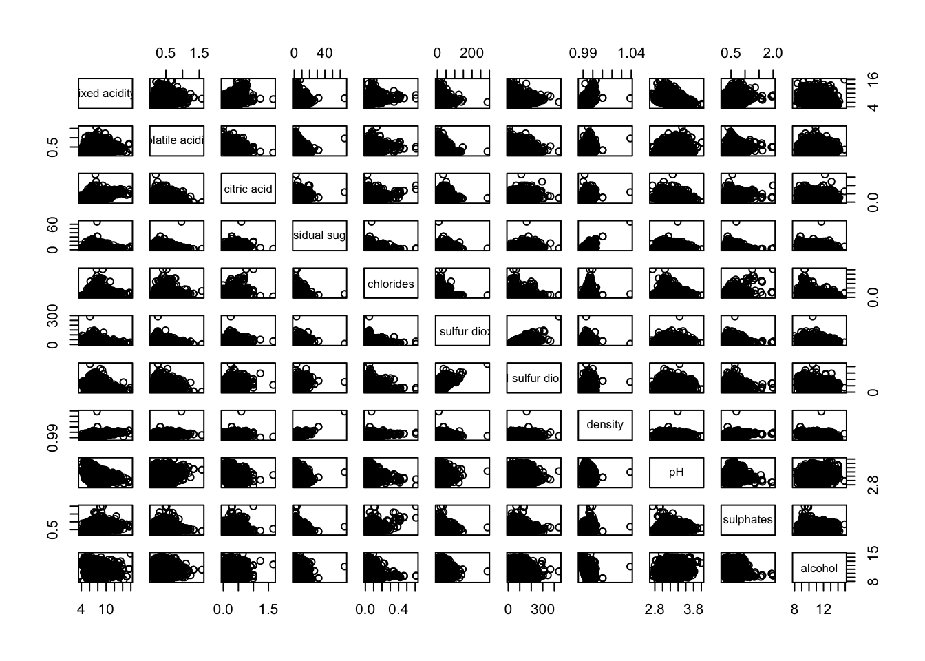
This created a scatter plot for each pair of columns.
We can also change the columns, e.g.
pairs(wine[,2:12])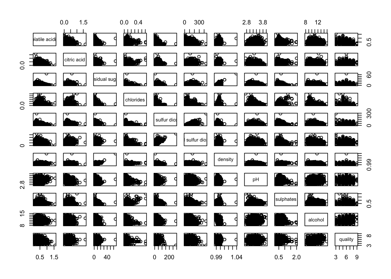
3.2 Drawing the corners
The basic graphs are good enough but the pairs are repeated on the upper diagonal and the lower diagonal.
We can just generate one of the halves.
pairs(wine[,2:12], upper.panel = NULL)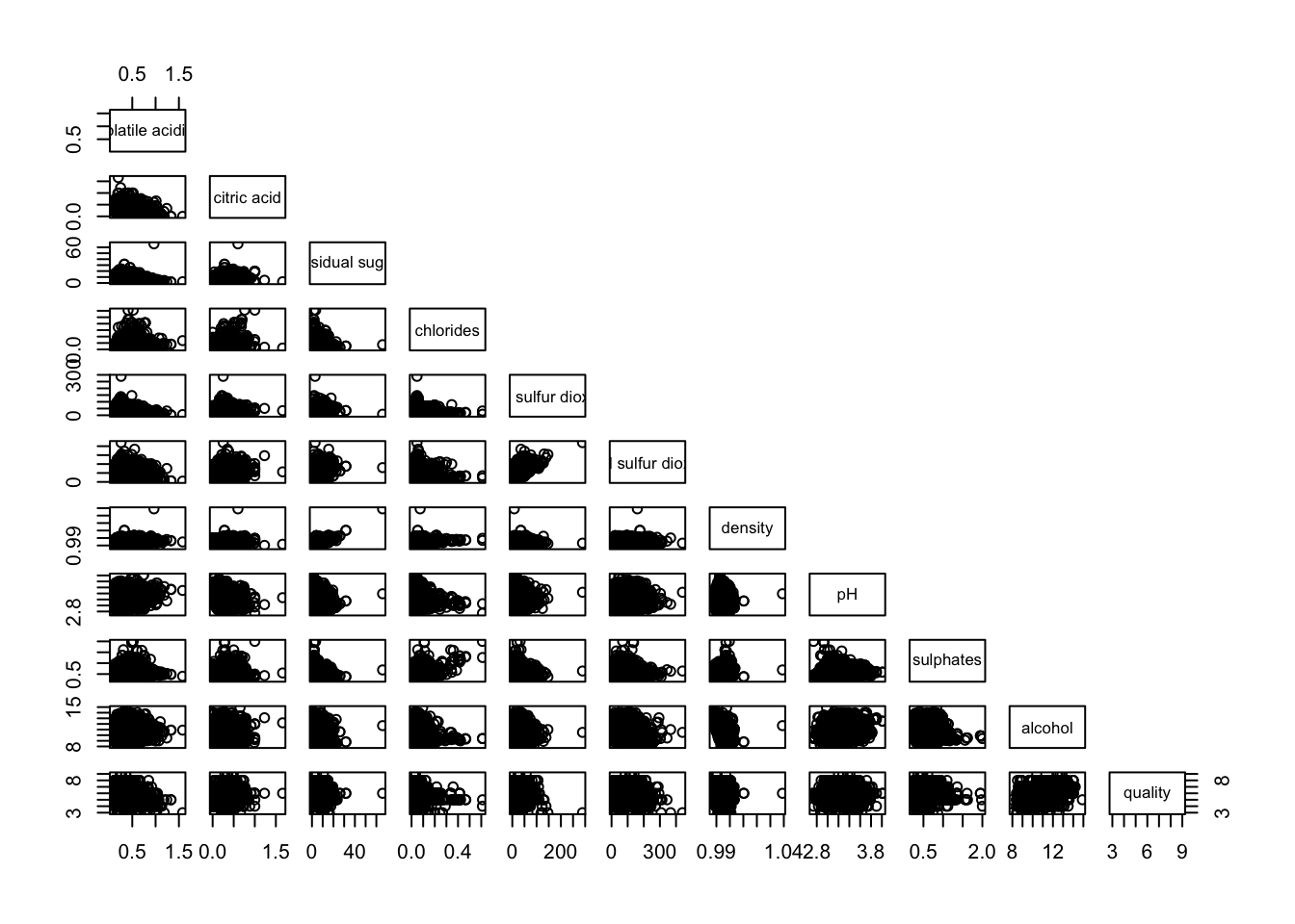
We can also just render the upper panel:
pairs(wine[,2:12], lower.panel = NULL)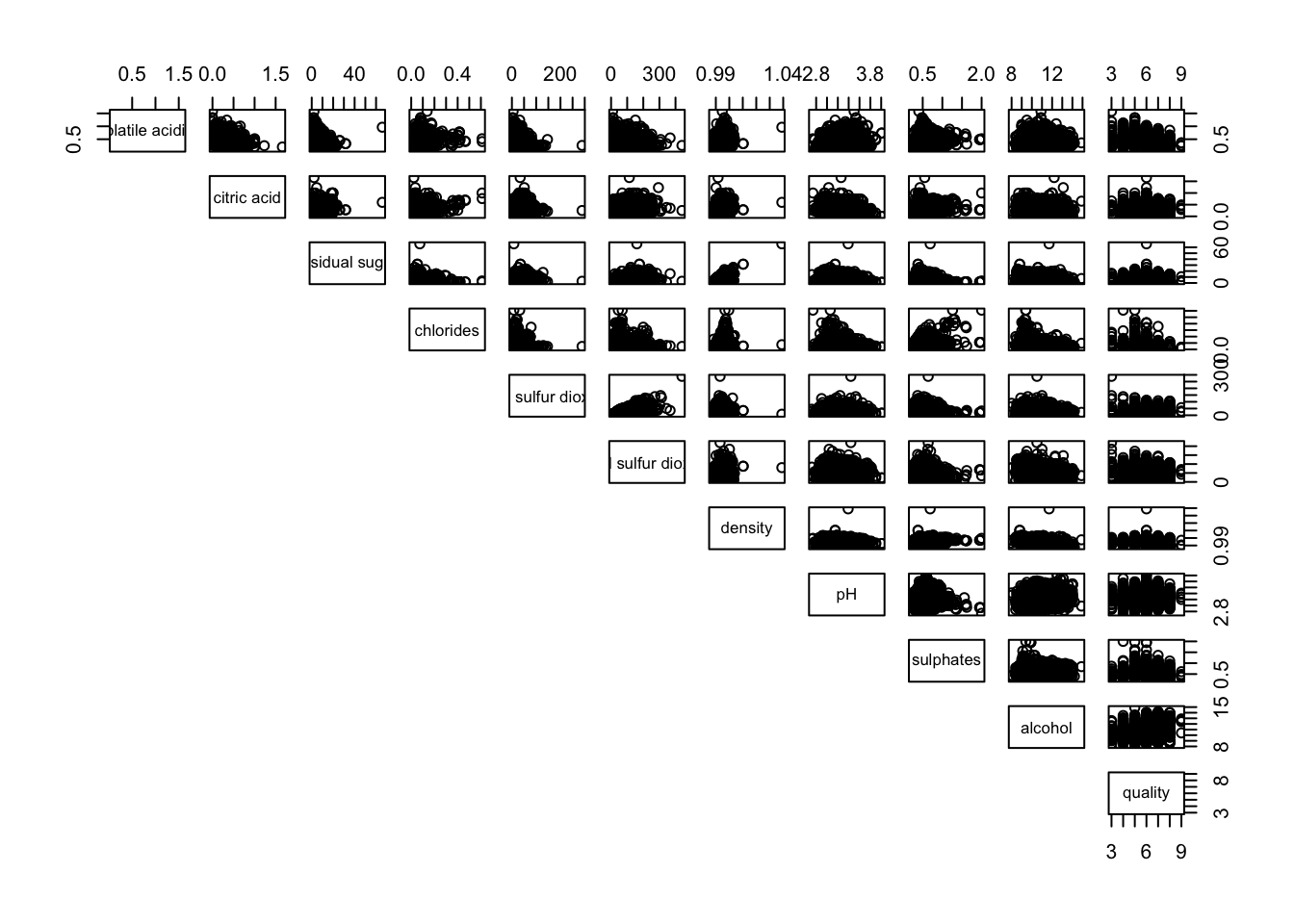
3.3 Adding correlation coefficient
We can also opt to render the correlation coefficients on one of the halves.
panel.cor <- function(x, y, digits=2, prefix="", cex.cor, ...) {
usr <- par("usr")
on.exit(par(usr))
par(usr = c(0, 1, 0, 1))
r <- abs(cor(x, y, use="complete.obs"))
txt <- format(c(r, 0.123456789), digits=digits)[1]
txt <- paste(prefix, txt, sep="")
if(missing(cex.cor)) cex.cor <- 0.8/strwidth(txt)
text(0.5, 0.5, txt, cex = cex.cor * (1 + r) / 2)
}

pairs(wine[,2:12],
      upper.panel = panel.cor)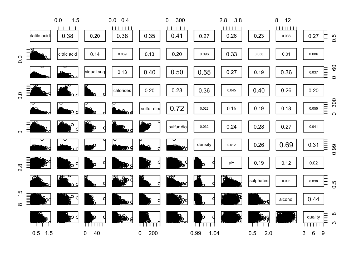
4 Visualizing Correlation Matrix using ggcorrmat()
Correlation matrices are important in determining which variables/dimensions to include in visualizations or analysis. We can simplify the analysis by only including one of the members of the correlated groups.
4.1 The basic plot
ggstatsplot::ggcorrmat(
  data = wine,
  cor.vars = 1:11)
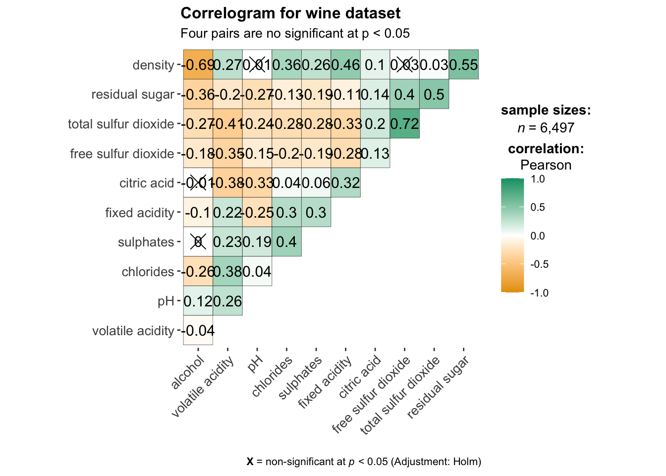
ggstatsplot::ggcorrmat(
  data = wine,
  cor.vars = 1:11,
  ggcorrplot.args = list(outline.color = "black",
                         hc.order = TRUE,
                         tl.cex = 10),
  title    = "Correlogram for wine dataset",
  subtitle = "Four pairs are no significant at p < 0.05"
)
5 Building multiple plots
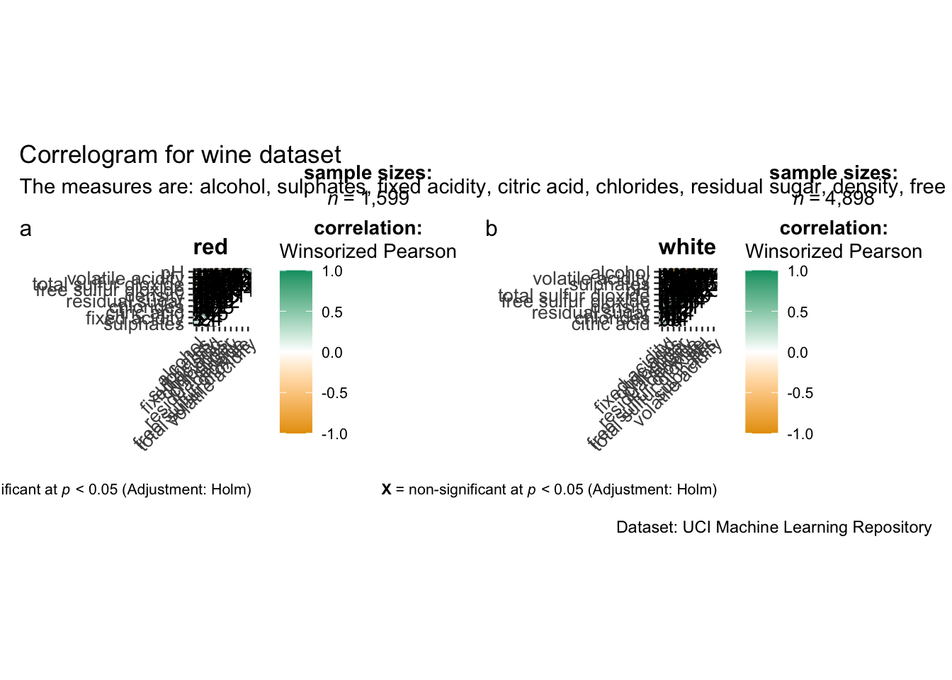
We can generate “facets” of correlogram using grouped_ggcorrmat().
grouped_ggcorrmat(
  data = wine,
  cor.vars = 1:11,
  grouping.var = type,
  type = "robust",
  p.adjust.method = "holm",
  plotgrid.args = list(ncol = 2),
  ggcorrplot.args = list(outline.color = "black",
                         hc.order = TRUE,
                         tl.cex = 10),
  annotation.args = list(
    tag_levels = "a",
    title = "Correlogram for wine dataset",
    subtitle = "The measures are: alcohol, sulphates, fixed acidity, citric acid, chlorides, residual sugar, density, free sulfur dioxide and volatile acidity",
    caption = "Dataset: UCI Machine Learning Repository"
  )
)
6 Visualizing Correlation Matrix using corrplot Package
The last way we will explore is the corrplot() package.
6.1 Computing the correlation matrix
To use corrplot(), we need to compute the correlation matrix first.
wine.cor <- cor(wine[, 1:11])We can finally use corrplot() to plot the correlation matrix.
corrplot(wine.cor)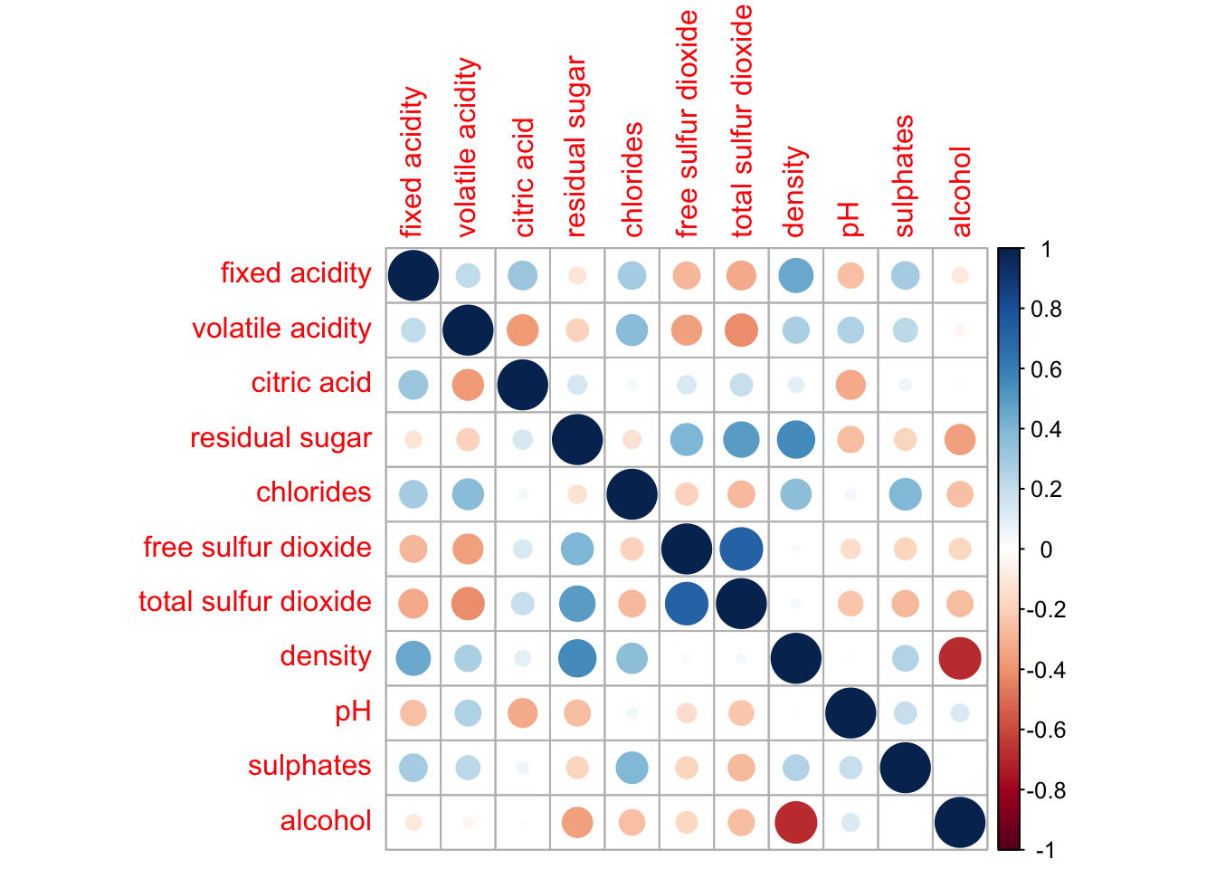
6.2 Working with visual geometrics
We can also change the shape in the correlation matrix
corrplot(wine.cor,
method = "ellipse") 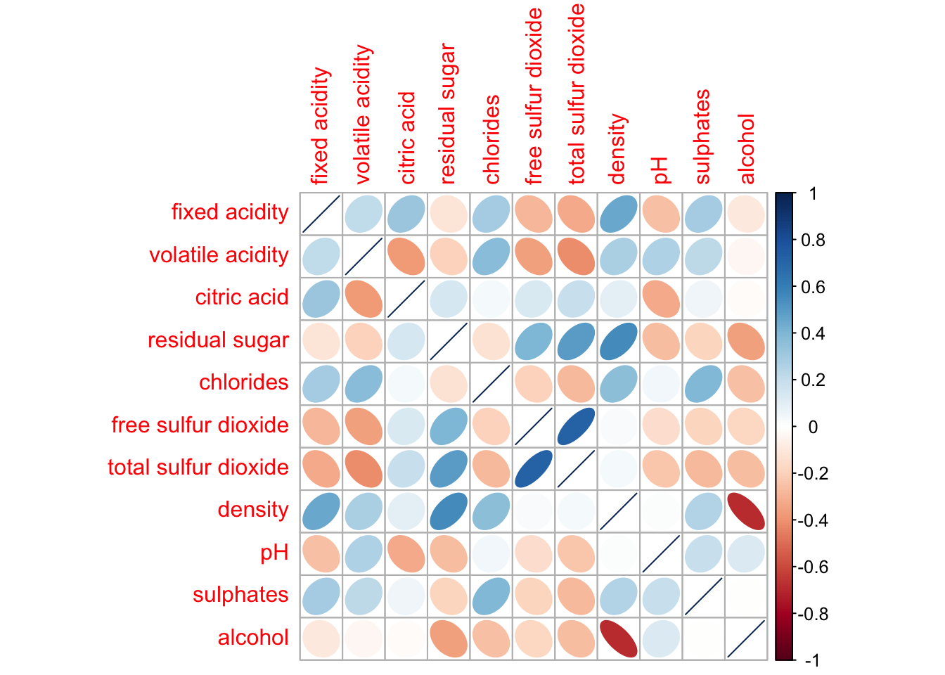
6.3 Working with layout
We can also chose to just render a half of the diagonal.
corrplot(wine.cor,
         method = "ellipse",
         type="lower")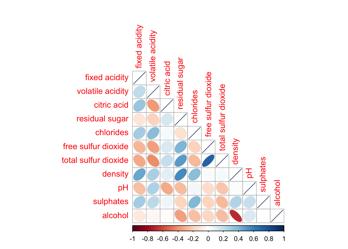
The plot can be styles as well
corrplot(wine.cor,
         method = "ellipse",
         type="lower",
         diag = FALSE,
         tl.col = "black")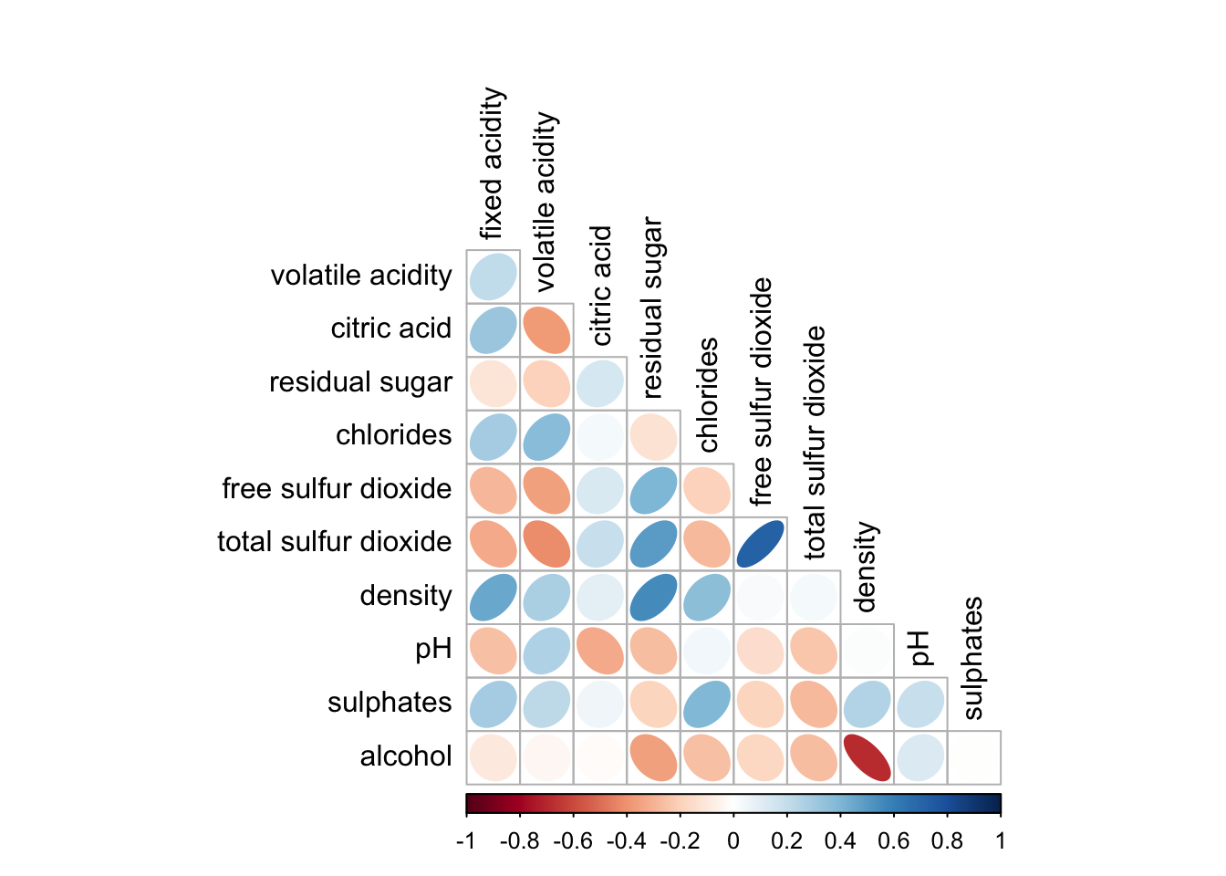
6.4 Mixed layouts
We can also generate different visualizations for each of the halves, e.g. geometric and numeric.
corrplot.mixed(wine.cor,
               lower = "ellipse",
               upper = "number",
               tl.pos = "lt",
               diag = "l",
               tl.col = "black")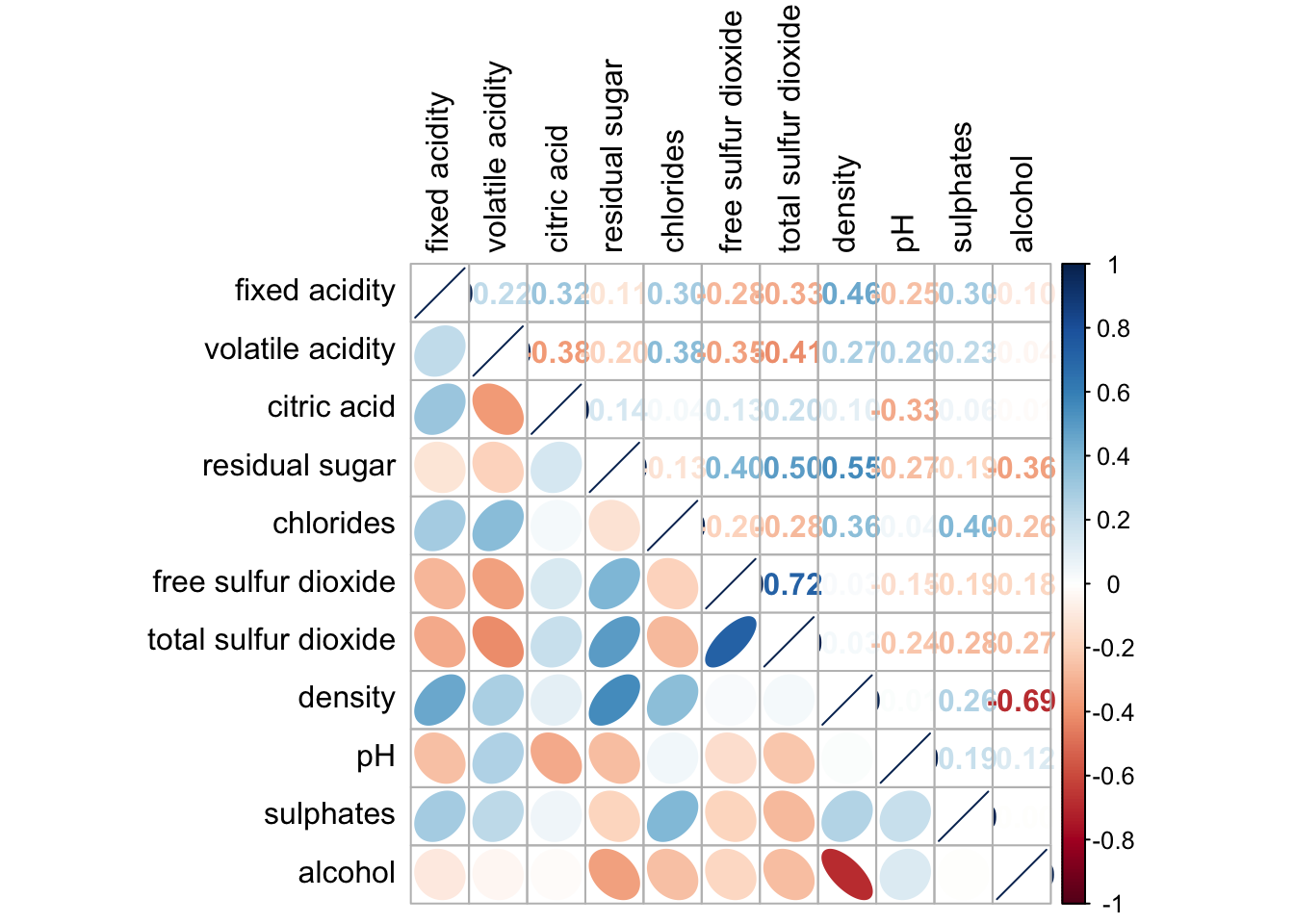
6.5 Combining corrgram with significant test
We will fill calculate the p-values.
wine.sig = cor.mtest(wine.cor, conf.level= .95)We will add this to the p.mat argument
corrplot(wine.cor,
         method = "number",
         type = "lower",
         diag = FALSE,
         tl.col = "black",
         tl.srt = 45,
         p.mat = wine.sig$p,
         sig.level = .05)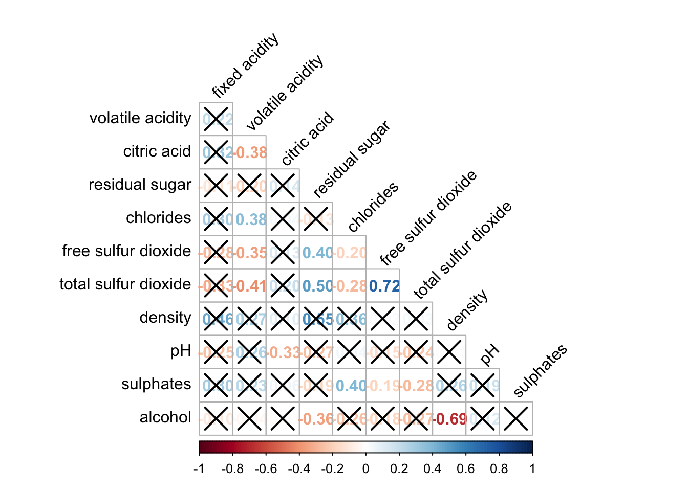
The ones that are crossed out are not correlated.
6.6 Reorder a corrgram
Matrix elements can be reordered via the order parameter.
corrplot.mixed(wine.cor,
               lower = "ellipse",
               upper = "number",
               tl.pos = "lt",
               diag = "l",
               order="AOE",
               tl.col = "black")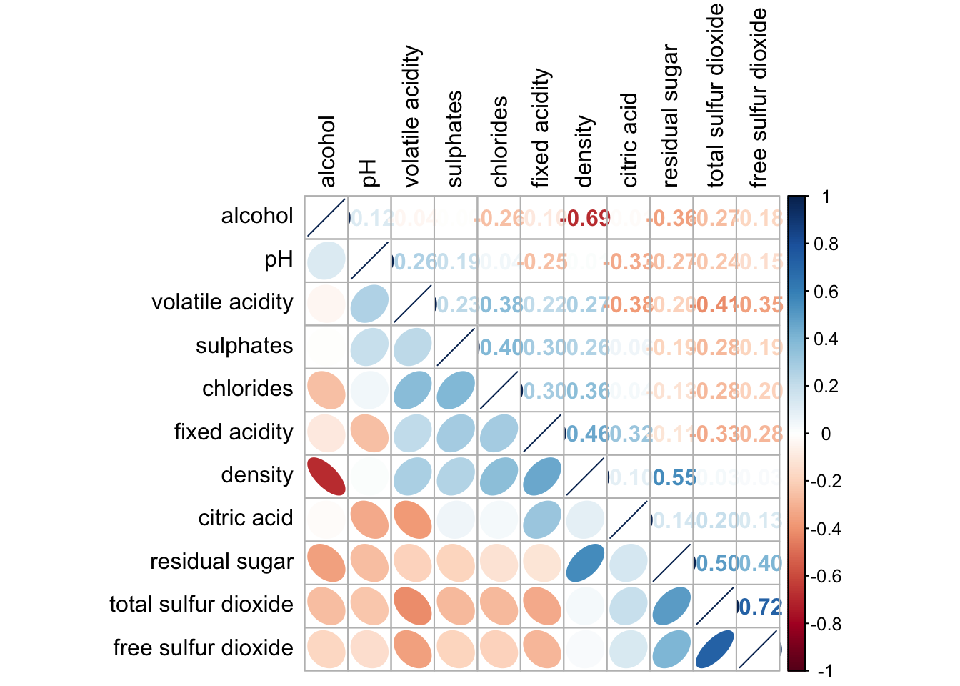
6.7 Reordering using hclust
corrplot(wine.cor,
         method = "ellipse",
         tl.pos = "lt",
         tl.col = "black",
         order="hclust",
         hclust.method = "ward.D",
         addrect = 3)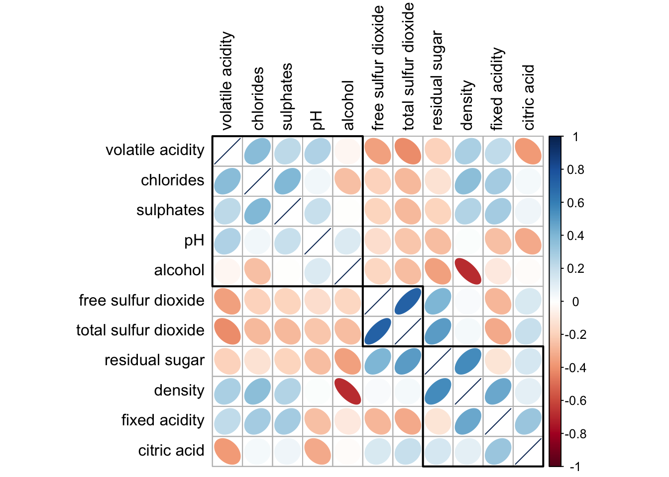
Reflections
We used correlation graphs in ISSS624 to identify which variables are highly correlated so that we don’t include more than 1 of them in the analysis.
However, this exercise made me aware that there are more visualization techniques that can be used.
Among the tools explored here, I prefer corrplot the most.