pacman::p_load(tidyverse, plotly, gifski, gganimate, DT, crosstalk, ggdist, knitr)
devtools::install_github("wilkelab/ungeviz")
library(ungeviz)Hands-on Exercise 4B: Visualizing Uncertainty
1 Overview
This hands-on exercise covers Chapter 11: Visual Uncertainty.
I learned about the following:
- plotting uncertainty through error bars
- creating hypothetical outcome plots (HOPs) by using ungeviz package
2 Getting Started
2.1 Loading the required packages
For this exercise we will use the following R packages:
tidyverse, a family of R packages for data science process,
plotly for creating interactive plot,
gganimate for creating animation plot,
gifski for gganimate to generate gif animations
DT for displaying interactive html table,
crosstalk for for implementing cross-widget interactions (currently, linked brushing and filtering), and
ggdist for visualising distribution and uncertainty.
ungeviz for visualizing uncertainty
knitr for rendering a simple table
I needed to install devtools first by Tools > Install Packages.
Added the following libraries from the ones of the chapter as they are also necessary to be install individually:
gifski
knitr
2.2 Loading the data
We will use the same exam_data dataset from Hands-on Ex 1 and load it into the RStudio environment using read_csv().
exam_data <- read_csv("data/Exam_data.csv")
glimpse(exam_data)
Rows: 322
Columns: 7
$ ID <chr> "Student321", "Student305", "Student289", "Student227", "Stude…
$ CLASS <chr> "3I", "3I", "3H", "3F", "3I", "3I", "3I", "3I", "3I", "3H", "3…
$ GENDER <chr> "Male", "Female", "Male", "Male", "Male", "Female", "Male", "M…
$ RACE <chr> "Malay", "Malay", "Chinese", "Chinese", "Malay", "Malay", "Chi…
$ ENGLISH <dbl> 21, 24, 26, 27, 27, 31, 31, 31, 33, 34, 34, 36, 36, 36, 37, 38…
$ MATHS <dbl> 9, 22, 16, 77, 11, 16, 21, 18, 19, 49, 39, 35, 23, 36, 49, 30,…
$ SCIENCE <dbl> 15, 16, 16, 31, 25, 16, 25, 27, 15, 37, 42, 22, 32, 36, 35, 45…There are a total of seven attributes in the exam_data tibble data frame. Four of them are categorical data type and the other three are in continuous data type.
The categorical attributes are:
ID,CLASS,GENDERandRACE.The continuous attributes are:
MATHS,ENGLISHandSCIENCE.
3 Visualizing the uncertainty of point estimates: ggplot2 methods
A point estimate is a single number, such as a mean. Uncertainty, on the other hand, is expressed as standard error, confidence interval, or credible interval.
We will plot error bars of maths scores by race by using data provided in exam tibble data frame.
Firstly, code chunk below will be used to derive the necessary summary statistics.
my_sum <- exam_data %>%
  group_by(RACE) %>%
  summarise(
    n=n(),
    mean=mean(MATHS),
    sd=sd(MATHS)
    ) %>%
  mutate(se=sd/sqrt(n-1))
Next, the code chunk below will be used to display my_sum tibble data frame in an html table format.
kable(my_sum)| RACE | n | mean | sd | se |
|---|---|---|---|---|
| Chinese | 193 | 76.50777 | 15.69040 | 1.132357 |
| Indian | 12 | 60.66667 | 23.35237 | 7.041005 |
| Malay | 108 | 57.44444 | 21.13478 | 2.043177 |
| Others | 9 | 69.66667 | 10.72381 | 3.791438 |
3.1 Plotting standard error bars of point estimates
Now we are ready to plot the standard error bars of mean maths score by race as shown below.
Show the code
ggplot(my_sum) +
  geom_errorbar(
    aes(x=RACE,
        ymin=mean-se,
        ymax=mean+se),
    width=0.2,
    colour="black",
    alpha=0.9,
    size=0.5) +
  geom_point(aes
           (x=RACE,
            y=mean),
           stat="identity",
           color="red",
           size = 1.5,
           alpha=1) +
  ggtitle("Standard error of mean maths score by rac")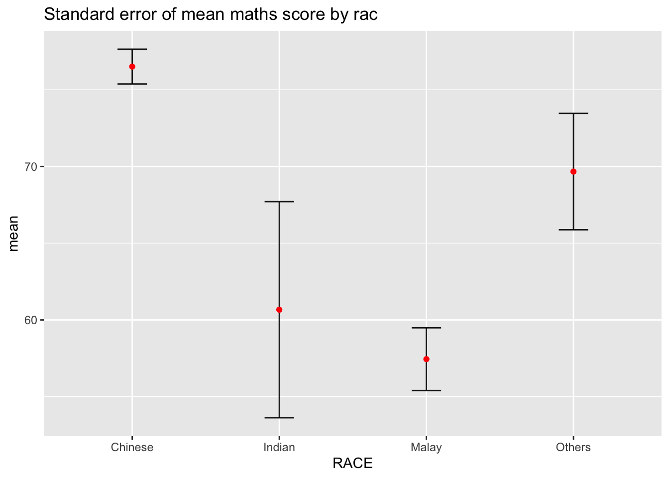
3.2 Plotting confidence interval of point estimates
Instead of plotting the standard error bar of point estimates, we can also plot the confidence intervals of mean maths score by race.
Show the code
ggplot(my_sum) +
  geom_errorbar(
    aes(x=reorder(RACE, -mean),
        ymin=mean-1.96*se,
        ymax=mean+1.96*se),
    width=0.2,
    colour="black",
    alpha=0.9,
    size=0.5) +
  geom_point(aes
           (x=RACE,
            y=mean),
           stat="identity",
           color="red",
           size = 1.5,
           alpha=1) +
  labs(x = "Maths score",
       title = "95% confidence interval of mean maths score by race")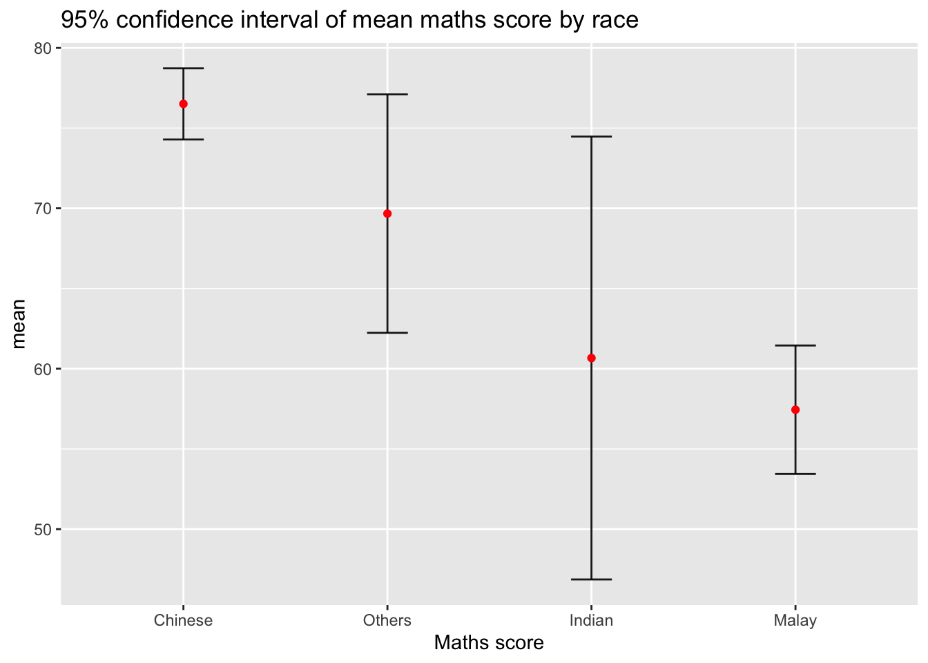
3.3 Visualizing the uncertainty of point estimates with interactive error bars
We will now plot interactive error bars for the 99% confidence interval of mean maths score by race as shown in the figure below.
Show the code
shared_df = SharedData$new(my_sum)

bscols(widths = c(4,8),
       ggplotly((ggplot(shared_df) +
                   geom_errorbar(aes(
                     x=reorder(RACE, -mean),
                     ymin=mean-2.58*se,
                     ymax=mean+2.58*se),
                     width=0.2,
                     colour="black",
                     alpha=0.9,
                     size=0.5) +
                   geom_point(aes(
                     x=RACE,
                     y=mean,
                     text = paste("Race:", `RACE`,
                                  "<br>N:", `n`,
                                  "<br>Avg. Scores:", round(mean, digits = 2),
                                  "<br>95% CI:[",
                                  round((mean-2.58*se), digits = 2), ",",
                                  round((mean+2.58*se), digits = 2),"]")),
                     stat="identity",
                     color="red",
                     size = 1.5,
                     alpha=1) +
                   xlab("Race") +
                   ylab("Average Scores") +
                   theme_minimal() +
                   theme(axis.text.x = element_text(
                     angle = 45, vjust = 0.5, hjust=1)) +
                   ggtitle("99% Confidence interval of average /<br>maths scores by race")),
                tooltip = "text"),
       DT::datatable(shared_df,
                     rownames = FALSE,
                     class="compact",
                     width="100%",
                     options = list(pageLength = 10,
                                    scrollX=T),
                     colnames = c("No. of pupils",
                                  "Avg Scores",
                                  "Std Dev",
                                  "Std Error")) %>%
         formatRound(columns=c('mean', 'sd', 'se'),
                     digits=2))
4 Visualising Uncertainty: ggdist package
ggdist is an R package that provides a flexible set of ggplot2 geoms and stats designed especially for visualising distributions and uncertainty.
It is designed for both frequentist and Bayesian uncertainty visualization, taking the view that uncertainty visualization can be unified through the perspective of distribution visualization:
for frequentist models, one visualises confidence distributions or bootstrap distributions (see vignette(“freq-uncertainty-vis”));
for Bayesian models, one visualises probability distributions (see the tidybayes package, which builds on top of ggdist).
4.1 Using stat_pointinterval()
We will build a visual for displaying distribution of maths scores by race.
exam_data %>%
  ggplot(aes(x = RACE,
             y = MATHS)) +
  stat_pointinterval() +
  labs(
    title = "Visualising confidence intervals of mean math score",
    subtitle = "Mean Point + Multiple-interval plot")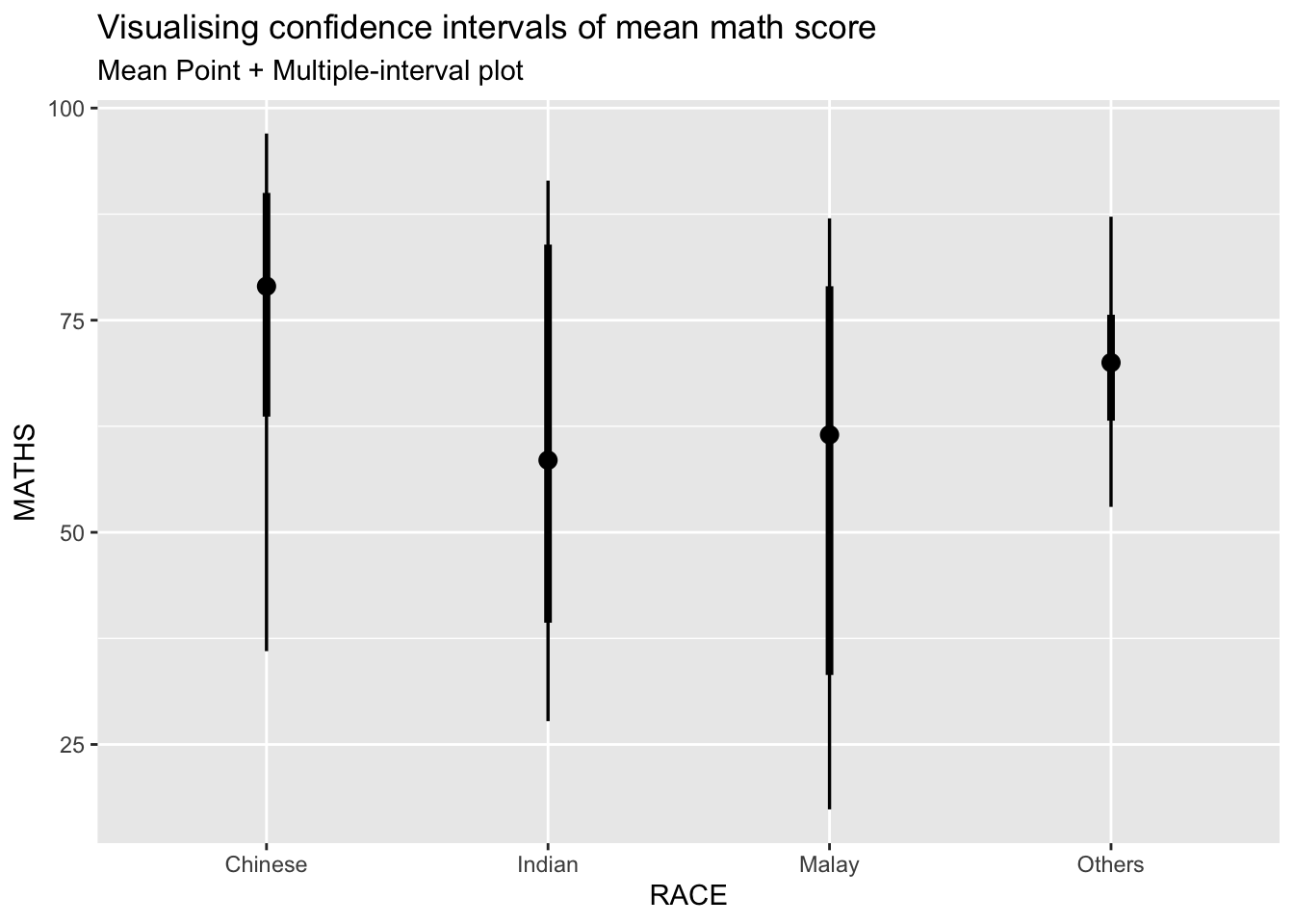
stat_pointinterval() can also be called with extra arguments
exam_data %>%
  ggplot(aes(x = RACE, y = MATHS)) +
  stat_pointinterval(.width = 0.95,
  .point = median,
  .interval = qi) +
  labs(
    title = "Visualising confidence intervals of median math score",
    subtitle = "Median Point + Multiple-interval plot")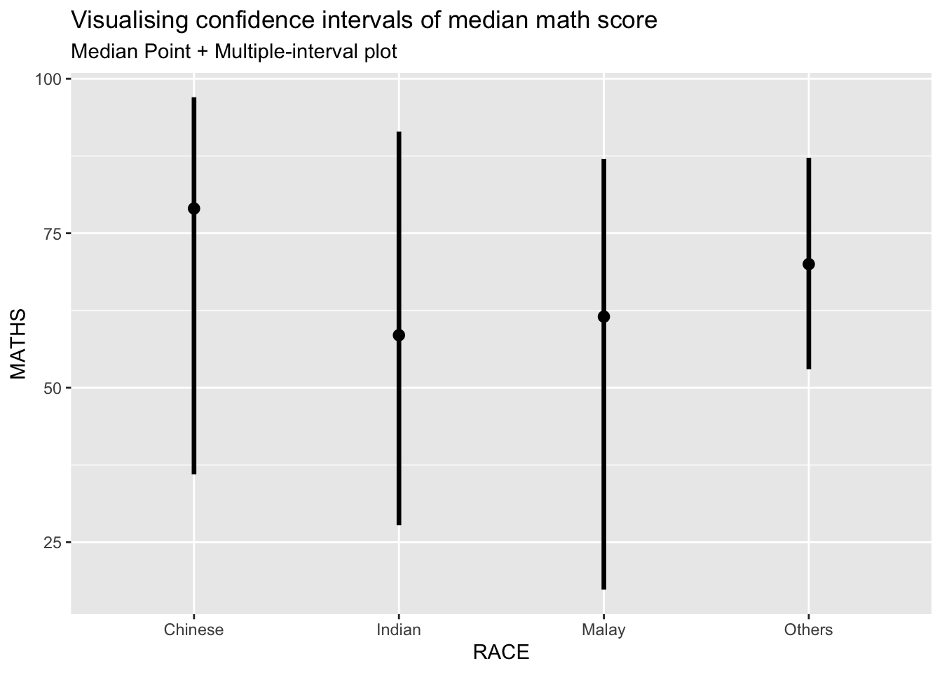
4.2 Using stat_pointinterval() (makeover)
The previous plot shows the 95% confidence interval. This plot below will show the 95% (thick line) to 99% (thin line) confidence interval.
The default for .width seems to be .width = c(0.66, 0.95) from the docs.
exam_data %>%
  ggplot(aes(x = RACE, y = MATHS)) +
  stat_pointinterval(.width = c(0.95, 0.99),
  .point = median,
  .interval = qi) +
  labs(
    title = "Visualising confidence intervals of median math score",
    subtitle = "Median Point + Multiple-interval plot")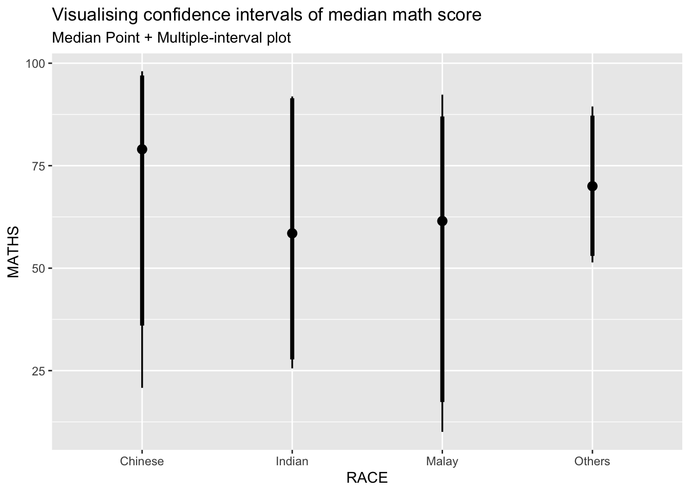
4.3 Using stat_gradientinterval()
In the code chunk below, stat_gradientinterval() of ggdist is used to build a visual for displaying distribution of maths scores by race.
exam_data %>%
  ggplot(aes(x = RACE,
             y = MATHS)) +
  stat_gradientinterval(
    fill = "skyblue",
    show.legend = TRUE
  ) +
  labs(
    title = "Visualising confidence intervals of mean math score",
    subtitle = "Gradient + interval plot")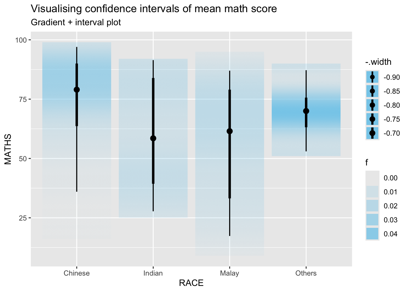
This plots gradients based on distribution. The darker color, the more observations with that value.
5 Visualising Uncertainty with Hypothetical Outcome Plots (HOPs)
We can plot an animation of HOPs using ungeviz.
ggplot(data = exam_data,
       (aes(x = factor(RACE), y = MATHS))) +
  geom_point(position = position_jitter(
    height = 0.3, width = 0.05),
    linewidth = 0.4, color = "#0072B2", alpha = 1/2) +
  geom_hpline(data = sampler(25, group = RACE), height = 0.6, color = "#D55E00") +
  theme_bw() +
  # `.draw` is a generated column indicating the sample draw
  transition_states(.draw, 1, 3)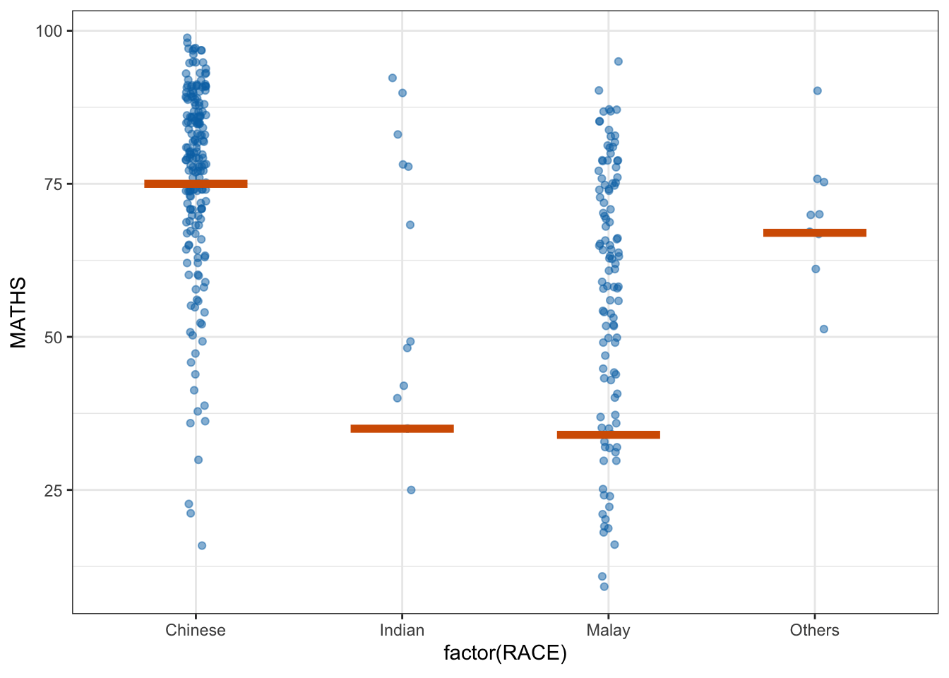
6 Reflections
There are various ways of visualizing uncertainty but I need to revise on the Math behind as I haven’t used these concepts for more than a decade. This is critical to interpreting data and to prevent misleading data stories.