pacman::p_load(ggrepel, patchwork,
               ggthemes, hrbrthemes,
tidyverse)Hands-on Exercise 2: Beyond ggplot Fundamentals
Overview
This hands-on exercise covers Chapter 2: Beyond ggplot Fundamentals.
I learned about the following:
Packages to extend
ggplot2Importing custom fonts
Composing figures using multiple graphs
Getting Started
Loading the required libraries
In Hands-on Ex 1, we only used tidyverse and ggplot2. In this exercise, 4 other R packages will be used:
ggrepel: an R package provides geoms for ggplot2 to repel overlapping text labels.
ggthemes: an R package provides some extra themes, geoms, and scales for ‘ggplot2’.
hrbrthemes: an R package provides typography-centric themes and theme components for ggplot2.
patchwork: an R package for preparing composite figure created using ggplot2.
Loading the data
We will use the same exam_data dataset from Hands-on Ex 1 and load it into the RStudio environment using read_csv().
exam_data <- read_csv("data/Exam_data.csv")
glimpse(exam_data)
Rows: 322
Columns: 7
$ ID <chr> "Student321", "Student305", "Student289", "Student227", "Stude…
$ CLASS <chr> "3I", "3I", "3H", "3F", "3I", "3I", "3I", "3I", "3I", "3H", "3…
$ GENDER <chr> "Male", "Female", "Male", "Male", "Male", "Female", "Male", "M…
$ RACE <chr> "Malay", "Malay", "Chinese", "Chinese", "Malay", "Malay", "Chi…
$ ENGLISH <dbl> 21, 24, 26, 27, 27, 31, 31, 31, 33, 34, 34, 36, 36, 36, 37, 38…
$ MATHS <dbl> 9, 22, 16, 77, 11, 16, 21, 18, 19, 49, 39, 35, 23, 36, 49, 30,…
$ SCIENCE <dbl> 15, 16, 16, 31, 25, 16, 25, 27, 15, 37, 42, 22, 32, 36, 35, 45…There are a total of seven attributes in the exam_data tibble data frame. Four of them are categorical data type and the other three are in continuous data type.
The categorical attributes are:
ID,CLASS,GENDERandRACE.The continuous attributes are:
MATHS,ENGLISHandSCIENCE.
Beyond ggplot2 Annotation: ggrepel
One of the challenge in plotting statistical graph is annotation, especially with large number of data points.
It makes it difficult to see individual data points, which makes it challenging to do data analysis.
Show the code
ggplot(data=exam_data,
       aes(x= MATHS,
           y=ENGLISH)) +
  geom_point() +
  geom_smooth(method=lm,
              linewidth=0.5) +
  geom_label(aes(label = ID),
             hjust = .5,
             vjust = -.5) +
  coord_cartesian(xlim=c(0,100),
                  ylim=c(0,100)) +
  ggtitle("English scores versus Maths scores for Primary 3")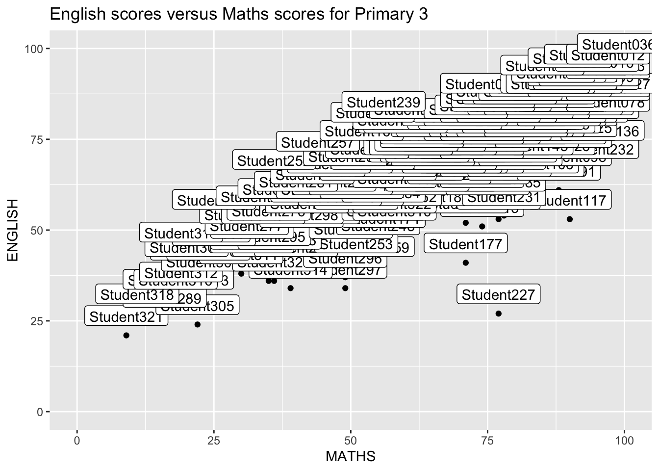
Working with ggreprel
ggrepel is an extension of ggplot2 package which provides geoms for ggplot2 to repel overlapping text like below.
We simply replace geom_text() by geom_text_repel() and geom_label() by geom_label_repel.
Show the code
ggplot(data=exam_data,
       aes(x= MATHS,
           y=ENGLISH)) +
  geom_point() +
  geom_smooth(method=lm,
              linewidth=0.5) +
  geom_label_repel(aes(label = ID),
             fontface="bold") +
  coord_cartesian(xlim=c(0,100),
                  ylim=c(0,100)) +
  ggtitle("English scores versus Maths scores for Primary 3")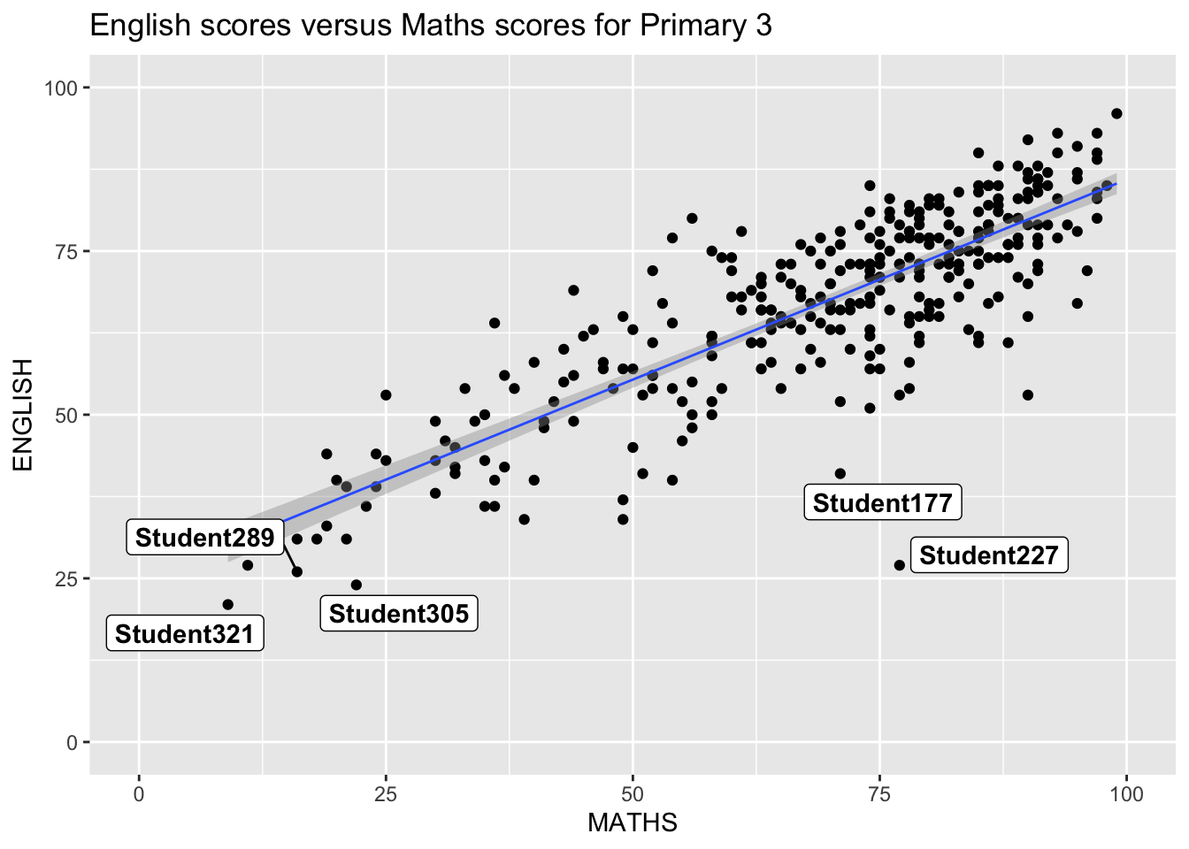
Beyond ggplot2 Themes
ggplot2 comes with eight built-in themes, they are: theme_gray(), theme_bw(), theme_classic(), theme_dark(), theme_light(), theme_linedraw(), theme_minimal(), and theme_void().
Show the code
ggplot(data=exam_data,
             aes(x = MATHS)) +
  geom_histogram(bins=20,
                 boundary = 100,
                 color="grey25",
                 fill="grey90") +
  theme_gray() +
ggtitle("Distribution of Maths scores") 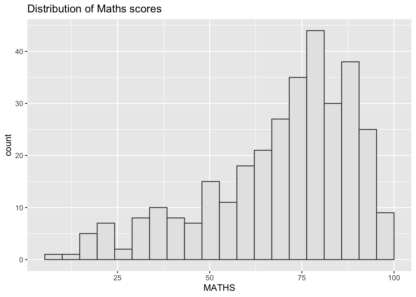
This link provides more information about ggplot2 Themes.
Working with ggtheme package
ggthemes provides ‘ggplot2’ themes that replicate the look of plots by Edward Tufte, Stephen Few, Fivethirtyeight, The Economist, ‘Stata’, ‘Excel’, and The Wall Street Journal, among others.
Some of the themes provided by the package are show below:
Show the code
ggplot(data=exam_data,
             aes(x = MATHS)) +
  geom_histogram(bins=20,
                 boundary = 100,
                 color="grey25",
                 fill="grey90") +
  ggtitle("Distribution of Maths scores") +
  theme_calc()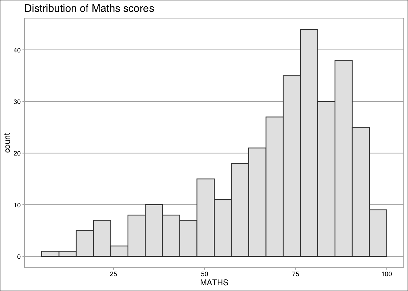
Show the code
ggplot(data=exam_data,
             aes(x = MATHS)) +
  geom_histogram(bins=20,
                 boundary = 100,
                 color="grey25",
                 fill="grey90") +
  ggtitle("Distribution of Maths scores") +
  theme_economist()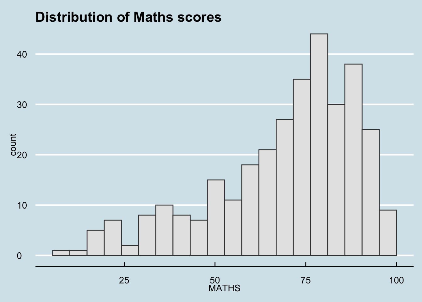
Show the code
ggplot(data=exam_data,
             aes(x = MATHS)) +
  geom_histogram(bins=20,
                 boundary = 100,
                 color="grey25",
                 fill="grey90") +
  ggtitle("Distribution of Maths scores") +
  theme_economist_white()
Show the code
ggplot(data=exam_data,
             aes(x = MATHS)) +
  geom_histogram(bins=20,
                 boundary = 100,
                 color="grey25",
                 fill="grey90") +
  ggtitle("Distribution of Maths scores") +
  theme_excel()
Show the code
ggplot(data=exam_data,
             aes(x = MATHS)) +
  geom_histogram(bins=20,
                 boundary = 100,
                 color="grey25",
                 fill="grey90") +
  ggtitle("Distribution of Maths scores") +
  theme_excel_new()
Show the code
ggplot(data=exam_data,
             aes(x = MATHS)) +
  geom_histogram(bins=20,
                 boundary = 100,
                 color="grey25",
                 fill="grey90") +
  ggtitle("Distribution of Maths scores") +
  theme_fivethirtyeight()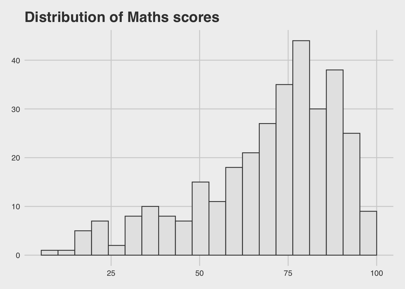
Show the code
ggplot(data=exam_data,
             aes(x = MATHS)) +
  geom_histogram(bins=20,
                 boundary = 100,
                 color="grey25",
                 fill="grey90") +
  ggtitle("Distribution of Maths scores") +
  theme_solarized()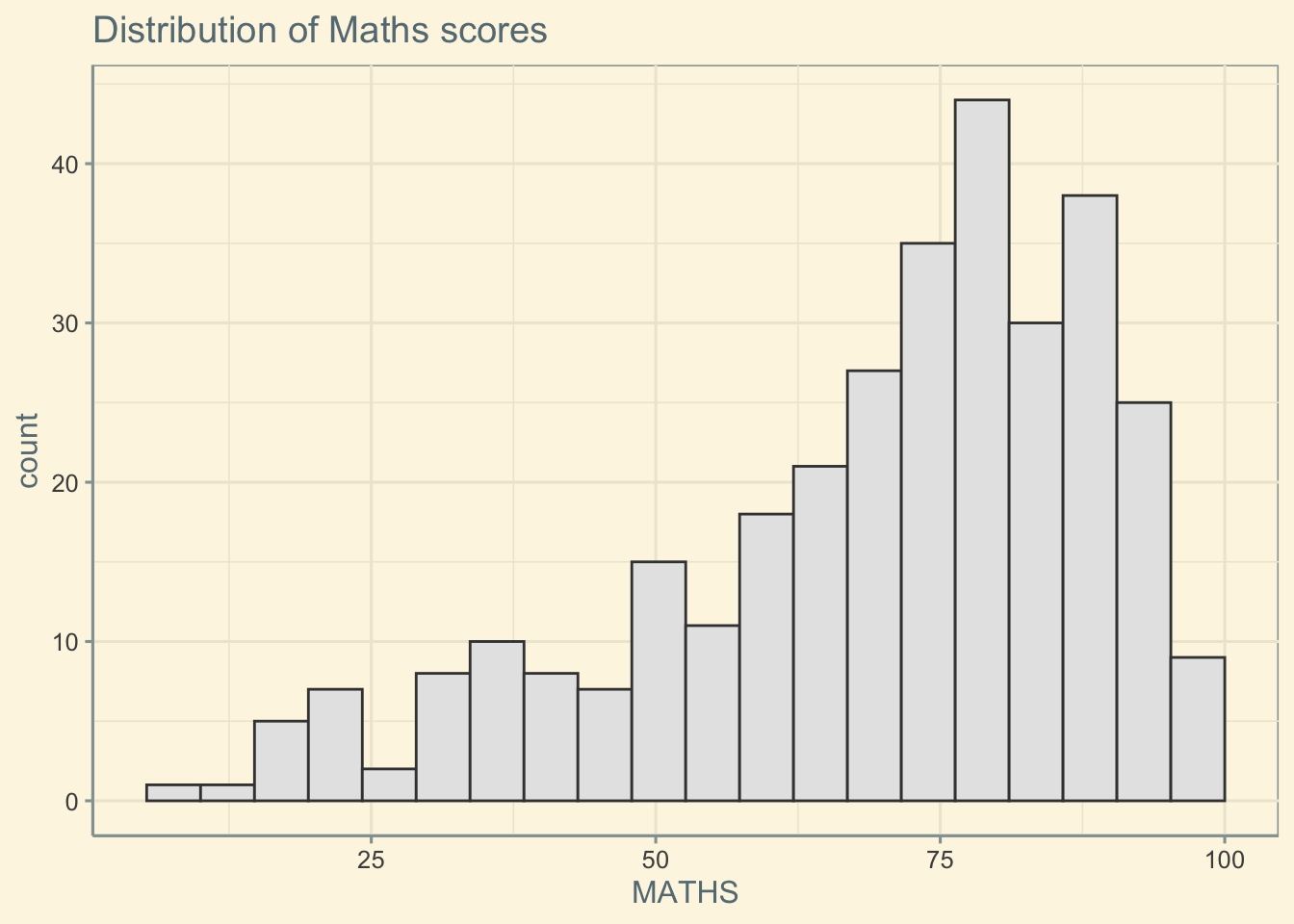
Show the code
ggplot(data=exam_data,
             aes(x = MATHS)) +
  geom_histogram(bins=20,
                 boundary = 100,
                 color="grey25",
                 fill="grey90") +
  ggtitle("Distribution of Maths scores") +
  theme_stata()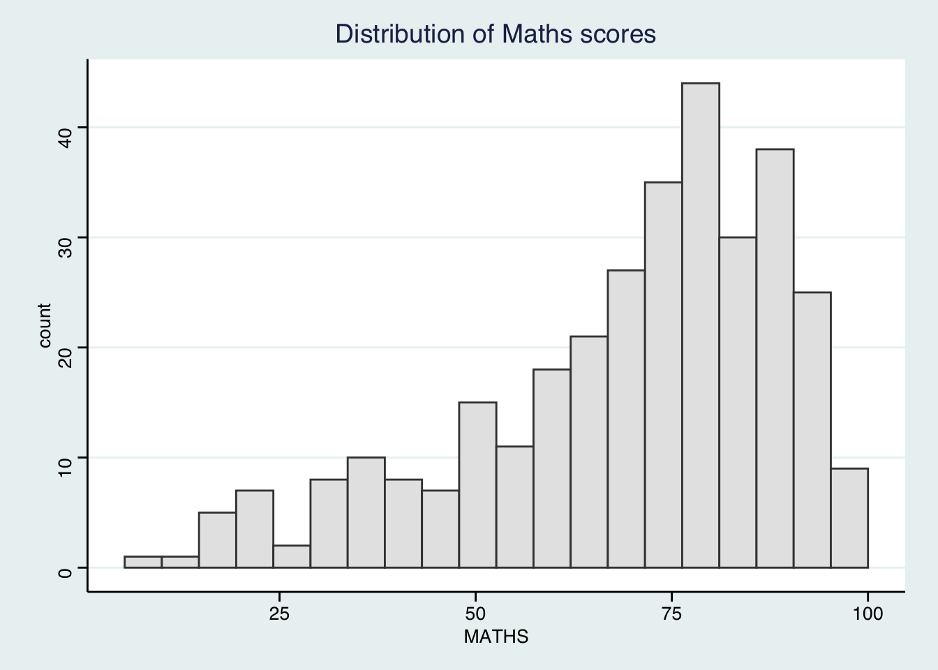
Show the code
ggplot(data=exam_data,
             aes(x = MATHS)) +
  geom_histogram(bins=20,
                 boundary = 100,
                 color="grey25",
                 fill="grey90") +
  ggtitle("Distribution of Maths scores") +
  theme_wsj()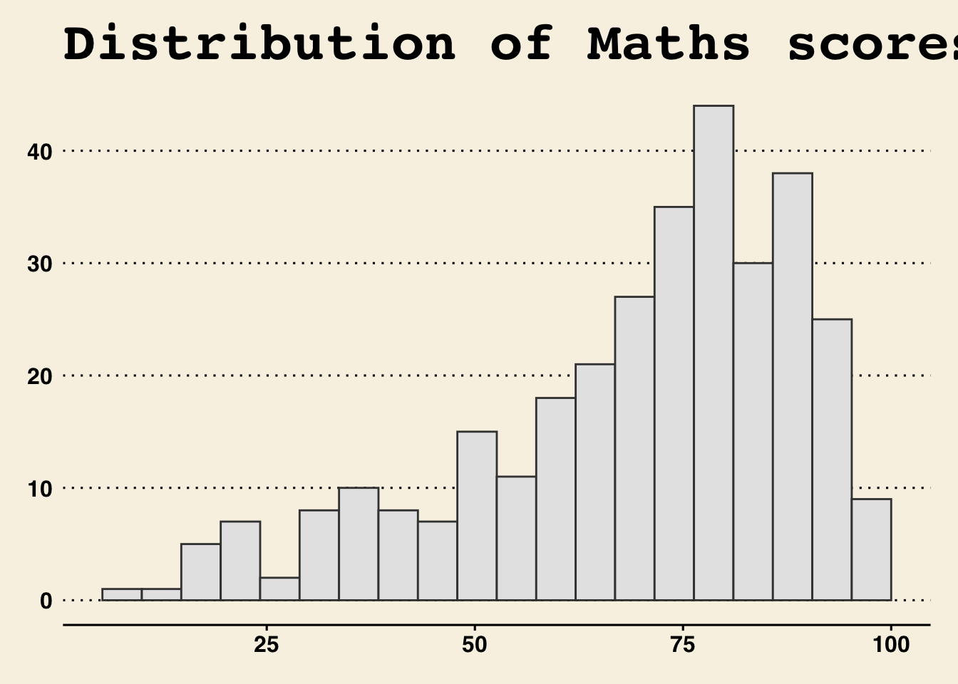
Working with hbrthemes package
hrbrthemes package provides a base theme that focuses on typographic elements, including where various labels are placed as well as the fonts that are used.
Importing required fonts
Some of the themes use custom fonts. To install these fonts, the corresponding import command must be run first, e.g.
import_econ_sans()This will show where there fonts are located.
Next, import the font in the location to your system.
Mac: https://support.apple.com/en-sg/guide/font-book/fntbk1000/mac
Windows: https://support.microsoft.com/en-us/office/add-a-font-b7c5f17c-4426-4b53-967f-455339c564c1
In future exercises, if these themes will be used, these steps must be added to the setup code chunk.
Some of the themes provided by the package are show below:
Note
Import Roboto Condensed font first:
import_roboto_condensed()Show the code
ggplot(data=exam_data,
             aes(x = MATHS)) +
  geom_histogram(bins=20,
                 boundary = 100,
                 color="grey25",
                 fill="grey90") +
  ggtitle("Distribution of Maths scores") +
  theme_ft_rc()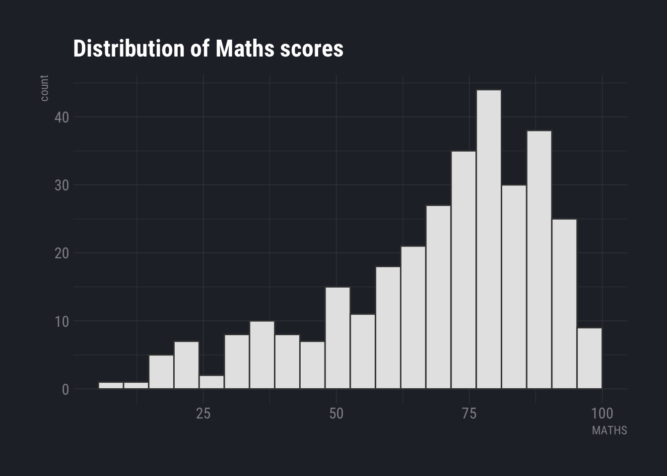
Show the code
ggplot(data=exam_data,
             aes(x = MATHS)) +
  geom_histogram(bins=20,
                 boundary = 100,
                 color="grey25",
                 fill="grey90") +
  ggtitle("Distribution of Maths scores") +
  theme_ipsum()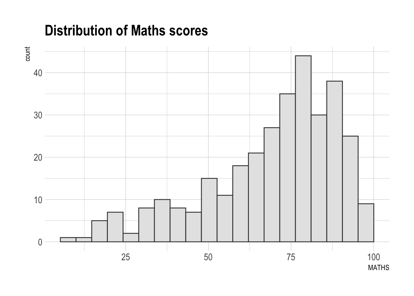
Note
This requires the Econ Sans font to be installed and imported first:
import_econ_sans()Show the code
ggplot(data=exam_data,
             aes(x = MATHS)) +
  geom_histogram(bins=20,
                 boundary = 100,
                 color="grey25",
                 fill="grey90") +
  ggtitle("Distribution of Maths scores") +
  theme_ipsum_es()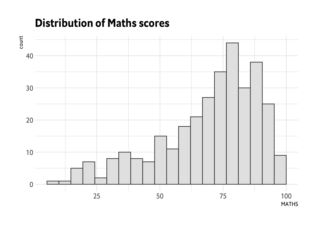
Note
Import Inter font first:
import_inter()After installing the font, run:
extrafont::font_import()Show the code
ggplot(data=exam_data,
             aes(x = MATHS)) +
  geom_histogram(bins=20,
                 boundary = 100,
                 color="grey25",
                 fill="grey90") +
  ggtitle("Distribution of Maths scores") +
  theme_ipsum_inter()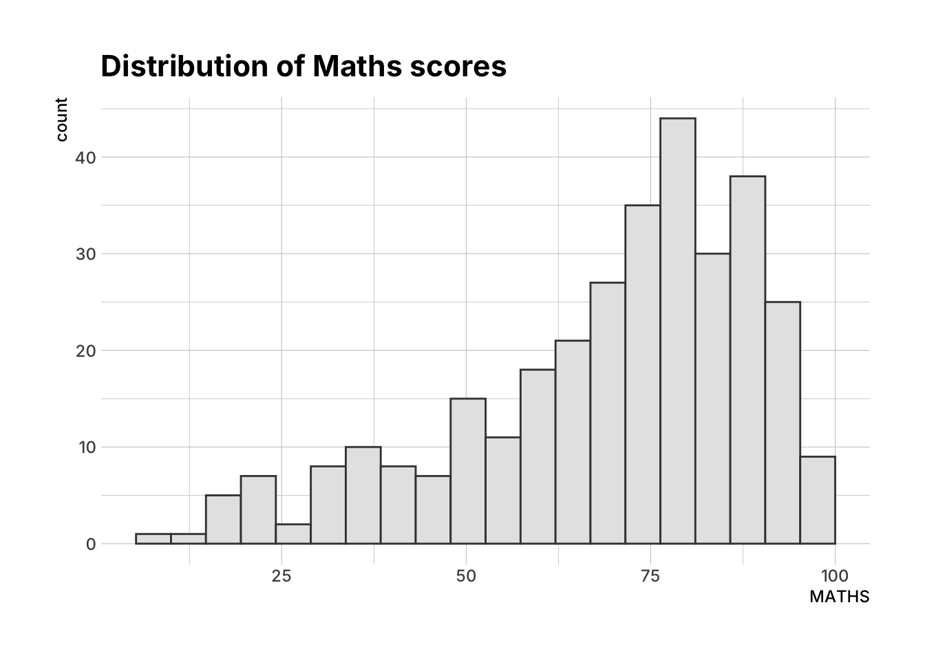
Note
This requires the Goldman Sans Condensed font to be installed and imported first:
import_goldman_sans()Show the code
ggplot(data=exam_data,
             aes(x = MATHS)) +
  geom_histogram(bins=20,
                 boundary = 100,
                 color="grey25",
                 fill="grey90") +
  ggtitle("Distribution of Maths scores") +
  theme_ipsum_gs()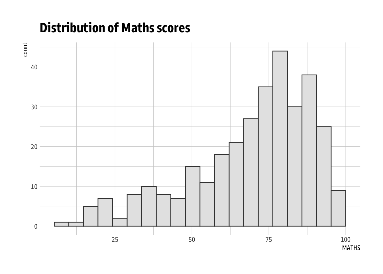
Beyond Single Graph
Sometimes a single graph is not enough to tell the full narrative, and it is necessary to plot multiple graphs to compose the narrative.
For this section, we will use the following graphs:
Base Graphs
Show the code
p1 <- ggplot(data=exam_data,
             aes(x = MATHS)) +
  geom_histogram(bins=20,
                 boundary = 100,
                 color="grey25",
                 fill="grey90") +
  coord_cartesian(xlim=c(0,100)) +
  ggtitle("Distribution of Maths scores")
p1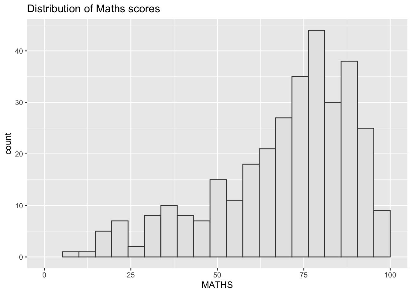
Show the code
p2 <- ggplot(data=exam_data,
             aes(x = ENGLISH)) +
  geom_histogram(bins=20,
                 boundary = 100,
                 color="grey25",
                 fill="grey90") +
  coord_cartesian(xlim=c(0,100)) +
  ggtitle("Distribution of English scores")
p2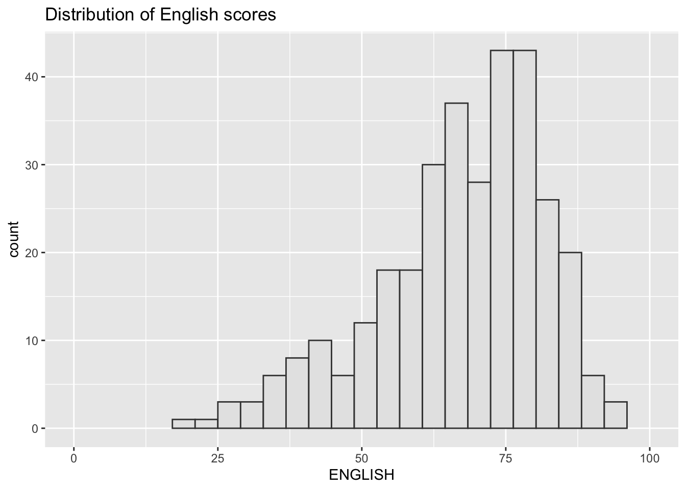
Show the code
p3 <- ggplot(data=exam_data,
             aes(x= MATHS,
                 y=ENGLISH)) +
  geom_point() +
  geom_smooth(method=lm,
              size=0.5) +
  coord_cartesian(xlim=c(0,100),
                  ylim=c(0,100)) +
  ggtitle("English vs Maths scores (Primary 3)")
p3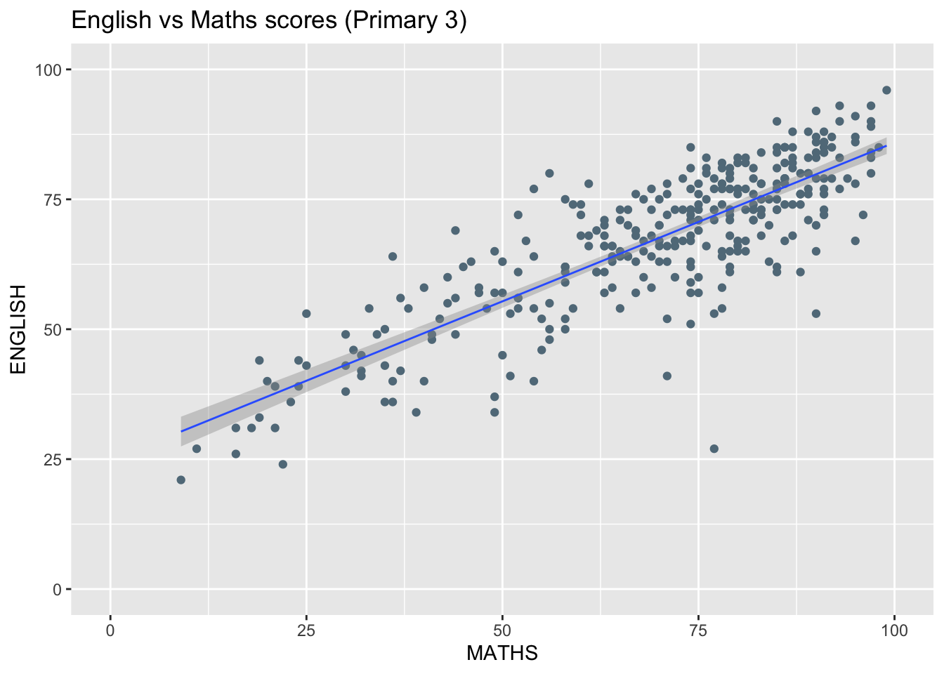
Creating Composite Graphics: pathwork methods
There are several ggplot2 extension’s functions support the needs to prepare composite figure by combining several graphs such as grid.arrange() of gridExtra package and plot_grid() of cowplot package. In this section, I am going to shared with you an ggplot2 extension called patchwork which is specially designed for combining separate ggplot2 graphs into a single figure.
Patchwork package has a very simple syntax where we can create layouts super easily. Here’s the general syntax that combines:
Two-Column Layout using the Plus Sign +.
Parenthesis () to create a subplot group.
Two-Row Layout using the Division Sign
/
Combining two ggplot2 graphs using ‘+’
Using + is the simplest way to combine multiple graphs. This will show them side by side
p1 + p2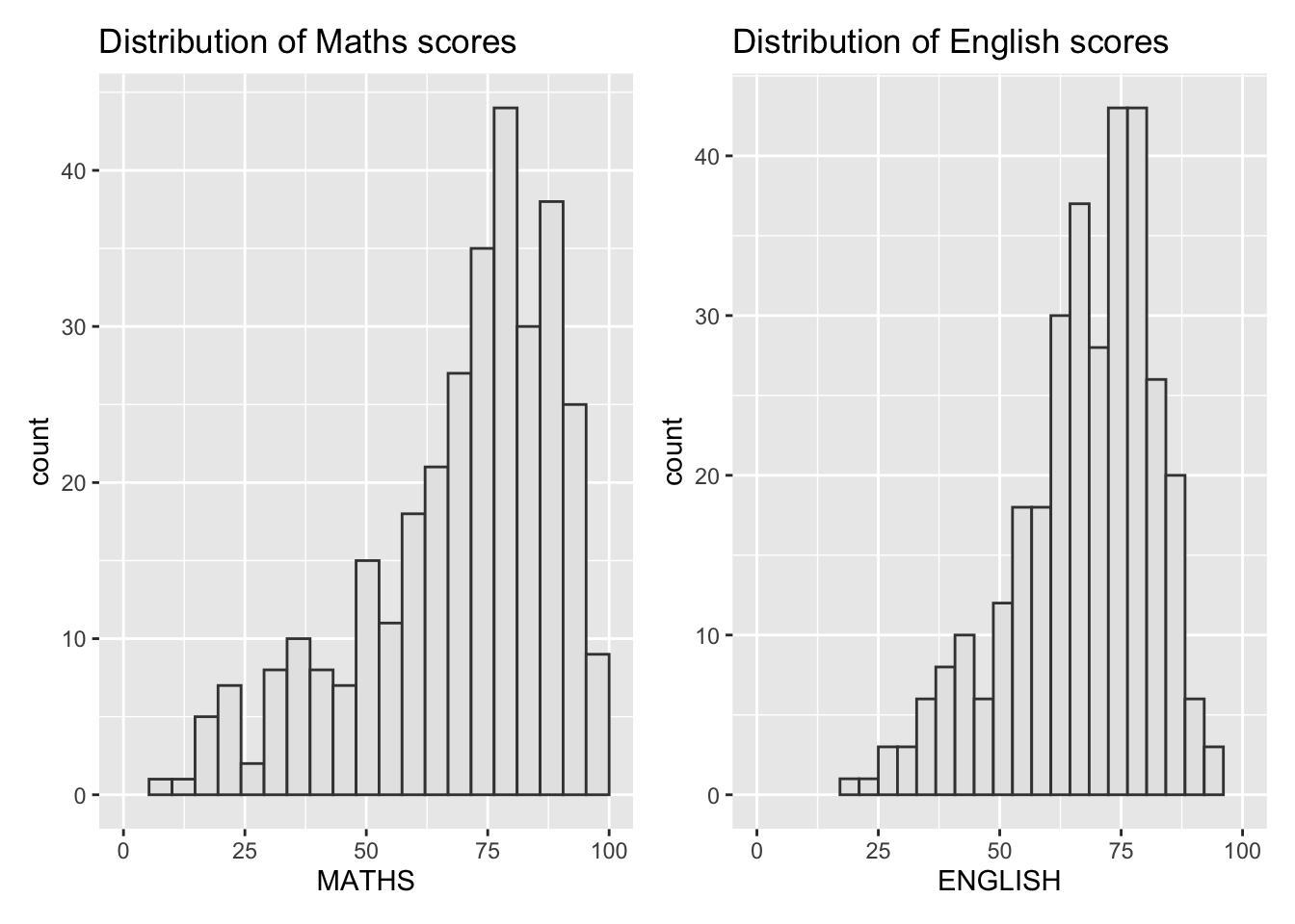
Combining three ggplot2 graphs using pathwork
Aside from +, patchwork provides other operators we can use to compose plots:
“/” operator to stack two ggplot2 graphs,
“|” operator to place the plots beside each other,
“()” operator the define the sequence of the plotting.
For example, if we want to stack the two bar graphs, and show the scatterplot to the right, we can do:
(p1 / p2) | p3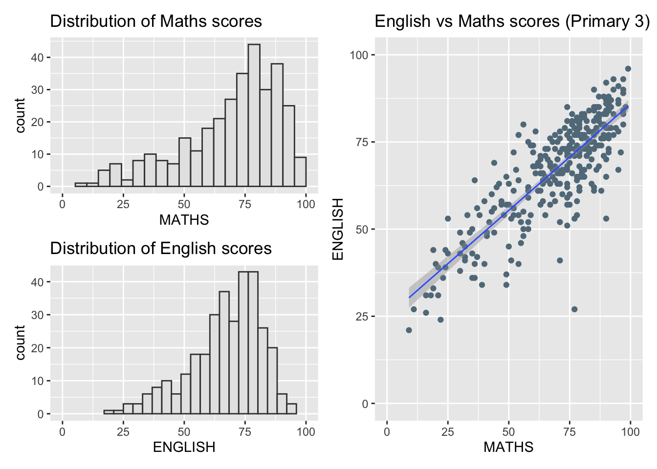
Tagging composed graphs
patchwork provides auto-tagging capabilities so the individual graphs can more easily be referred in text.
((p1 / p2) | p3) +
  plot_annotation(tag_levels = '1')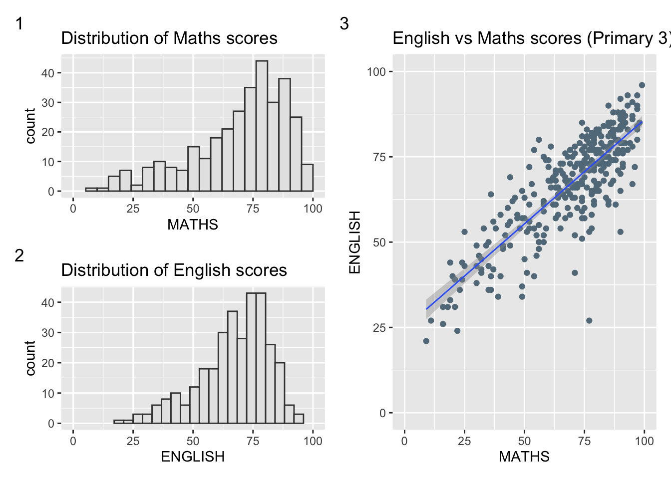
For example, we can refer to the Distributions of Maths scores graph as Graph 1, corresponding to the annotation provided.
Creating figure with insert
Beside providing functions to place plots next to each other based on the provided layout. With inset_element() of patchwork, we can place one or several plots or graphic elements freely on top or below another plot.
p3 + inset_element(p2,
                   left = 0.02,
                   bottom = 0.7,
                   right = 0.5,
                   top = 1)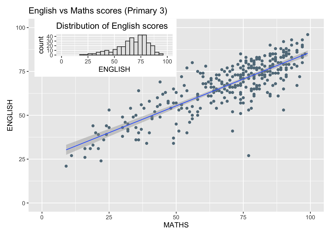
This is useful for providing supplementary details to the main graph.
Applying themes to the composite figure
We can apply the theme by using & theme_() to the patchwork result.
patchwork <- (p1 / p2) | p3
patchwork & theme_economist()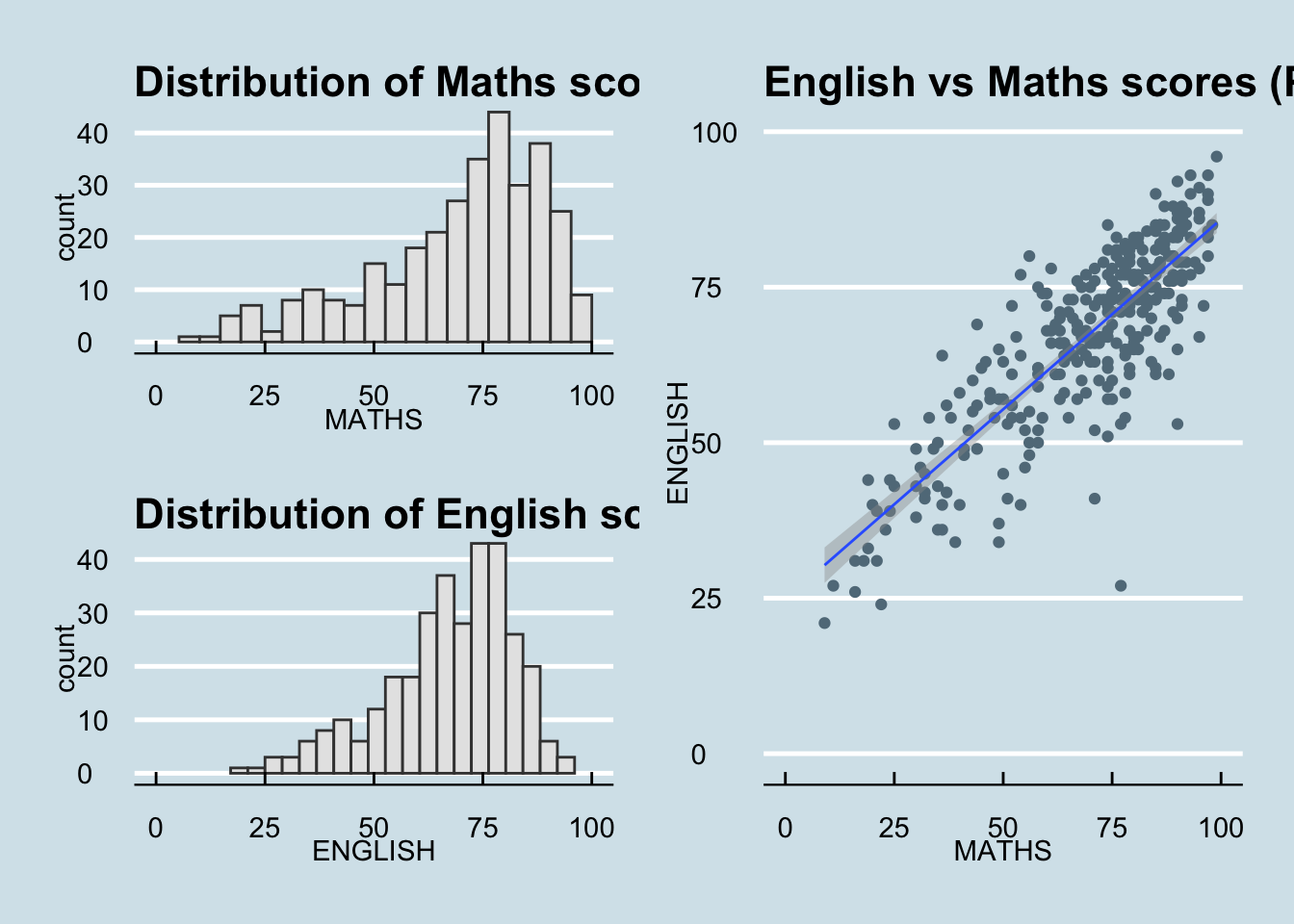
patchwork <- (p1 / p2) | p3
patchwork & theme_ipsum_es()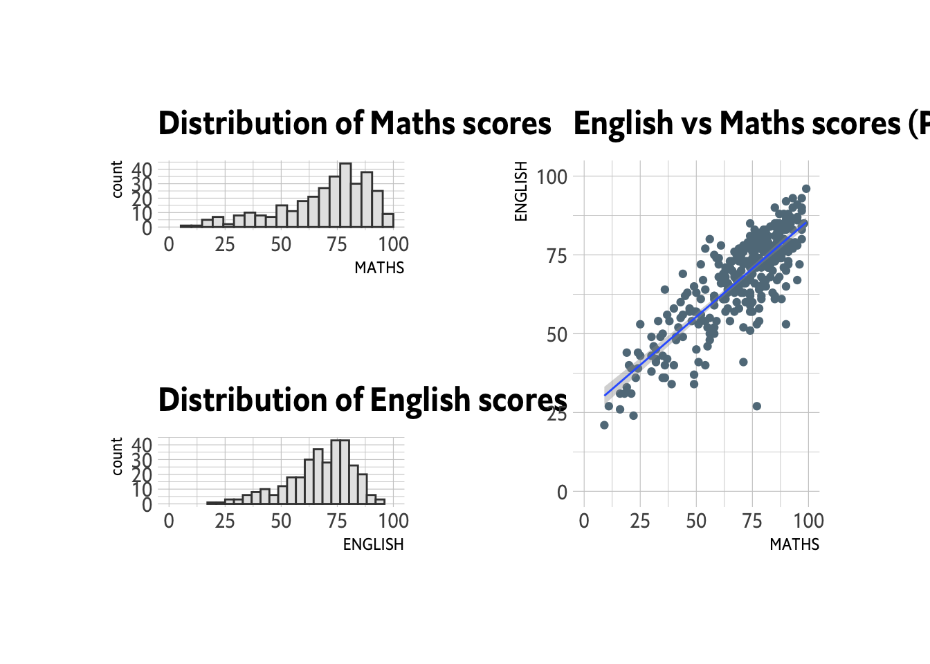
Reflections
`ggplot2` provides the base for creating graphs. However, there are other use cases that necessitate expanding its functions to create figures that fit the desired narrative.
There are various reasons of this. One is for aesthetics and branding, which is why some of the themes explored here align with the branding of some media outlets (e.g. Wall Street Journal, The Economist, 538, etc).
Another reason demonstrated here is for composing multiple graphs to provide a more complete narrative. Hence, patchwork is introduced.
Lastly, it can be for user experience. ggrepel helps make graphs visually cleaner so there is less noise.
I am sure there are other tools beyond the ones explored in this exercise. Hence, when we do our project, we must look at what narrative we would like to provide, and find the right tools to do that.