pacman::p_load(readxl, gifski, gapminder,
plotly, gganimate, tidyverse)Hands-on Exercise 3B: Programming Animated Statistical Graphics with R
1 Overview
This hands-on exercise covers Chapter 4: Programming Animated Statistical Graphics with R.
I learned about the following:
Basic concepts of animation, in the context of data visualization, 1 plot = 1 frame. We can adjust animation attributes like duration of the frame
Animating graphics using
plotlyandgganimate
2 Getting Started
2.1 Loading the required packages
For this exercise we will use the following R packages:
plotly, R library for plotting interactive statistical graphs.
gganimate, an ggplot extension for creating animated statistical graphs.
gifski converts video frames to GIF animations using pngquant’s fancy features for efficient cross-frame palettes and temporal dithering. It produces animated GIFs that use thousands of colors per frame.
gapminder: An excerpt of the data available at Gapminder.org. We just want to use its country_colors scheme.
tidyverse, a family of modern R packages specially designed to support data science, analysis and communication task including creating static statistical graphs.
2.2 Loading the data
We will use the same `GlobalPopulation` dataset from eLearn and load it into the RStudio environment using read_xls().
globalPop <- read_xls("data/GlobalPopulation.xls",
                      sheet="Data") %>%
  mutate(across(.cols = c("Country", "Continent"), .fns = as.factor)) %>%
  mutate(Year = as.integer(Year))

glimpse(globalPop)
Rows: 6,204
Columns: 6
$ Country <fct> "Afghanistan", "Afghanistan", "Afghanistan", "Afghanistan",…
$ Year <int> 1996, 1998, 2000, 2002, 2004, 2006, 2008, 2010, 2012, 2014,…
$ Young <dbl> 83.6, 84.1, 84.6, 85.1, 84.5, 84.3, 84.1, 83.7, 82.9, 82.1,…
$ Old <dbl> 4.5, 4.5, 4.5, 4.5, 4.5, 4.6, 4.6, 4.6, 4.6, 4.7, 4.7, 4.7,…
$ Population <dbl> 21559.9, 22912.8, 23898.2, 25268.4, 28513.7, 31057.0, 32738…
$ Continent <fct> Asia, Asia, Asia, Asia, Asia, Asia, Asia, Asia, Asia, Asia,…There are a total of 6 attributes in the globalPop tibble data frame. Two of them are categorical data type and the other three are numeric.
The categorical attributes are:
Country, andContinent.The numeris attributes are:
Year,Young,Old, andPopulation.
3 Animating visualizations using gganimate
gganimate extends the grammar of graphics as implemented by ggplot2 to include the description of animation. It does this by providing a range of new grammar classes that can be added to the plot object in order to customise how it should change with time.
transition_*()defines how the data should be spread out and how it relates to itself across time.view_*()defines how the positional scales should change along the animation.shadow_*()defines how data from other points in time should be presented in the given point in time.enter_*()/exit_*()defines how new data should appear and how old data should disappear during the course of the animation.ease_aes()defines how different aesthetics should be eased during transitions.
3.1 Building a static population bubble plot
We will first plot a static bubble plot using geom_dots().
ggplot(globalPop, aes(x = Old, y = Young,
                      size = Population,
                      colour = Country)) +
  geom_point(alpha = 0.7,
             show.legend = FALSE) +
  scale_colour_manual(values = country_colors) +
  scale_size(range = c(2, 12)) +
  labs(title = 'Year: {frame_time}',
       x = '% Aged',
       y = '% Young')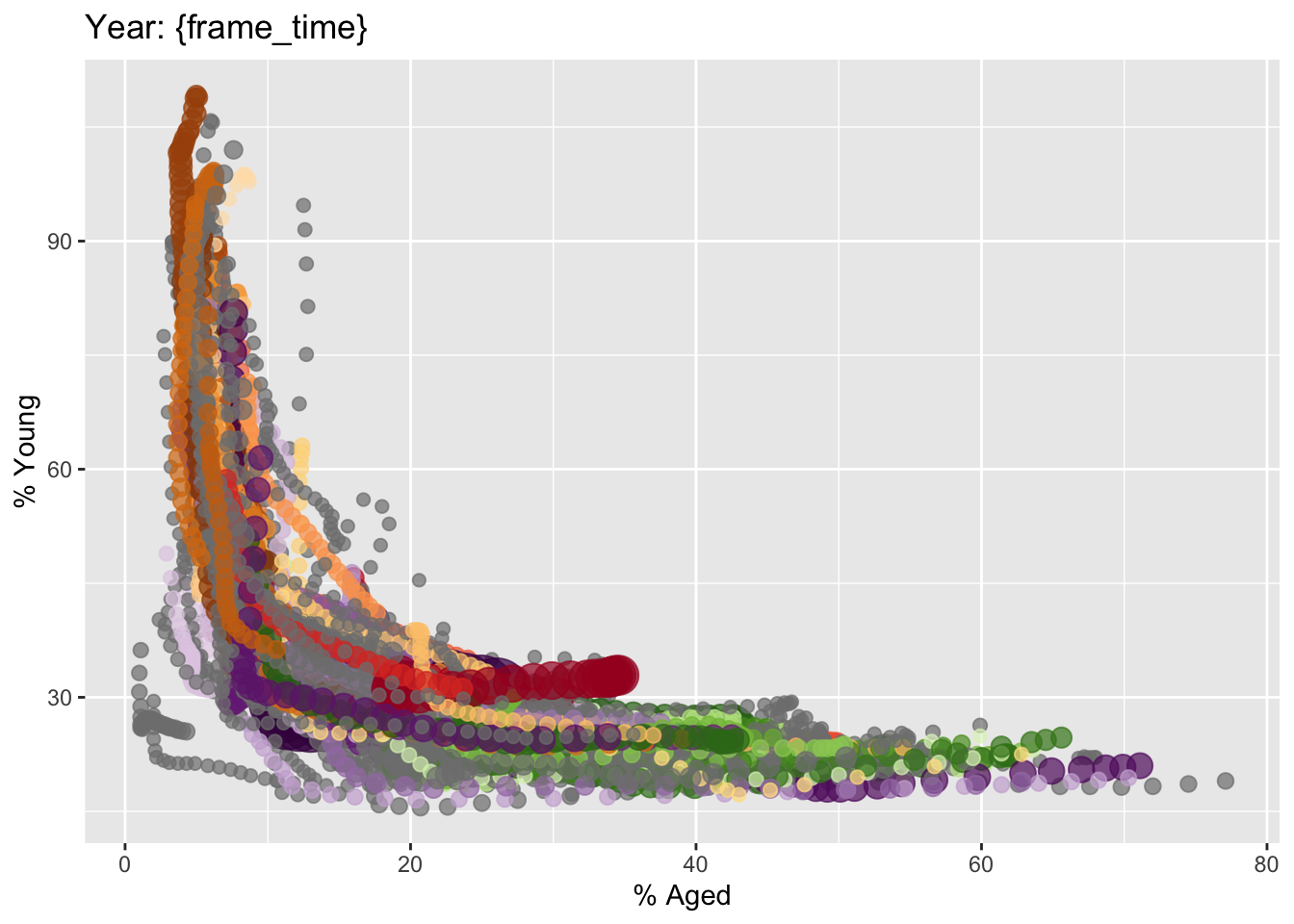
The title has Year: {frame time} as we will use the year plots as the frames in animation.
3.2 Building the animated bubble plot
We will now animate the plot by year by adding the following functions to the existing plot:
transition_time()of gganimate is used to create transition through distinct states in time (i.e. Year).ease_aes()is used to control easing of aesthetics. The default islinear. Other methods are: quadratic, cubic, quartic, quintic, sine, circular, exponential, elastic, back, and bounce.
ggplot(globalPop, aes(x = Old, y = Young,
                      size = Population,
                      colour = Country)) +
  geom_point(alpha = 0.7,
             show.legend = FALSE) +
  scale_colour_manual(values = country_colors) +
  scale_size(range = c(2, 12)) +
  labs(title = 'Year: {frame_time}',
       x = '% Aged',
       y = '% Young') +
  transition_time(Year) +
  ease_aes('linear')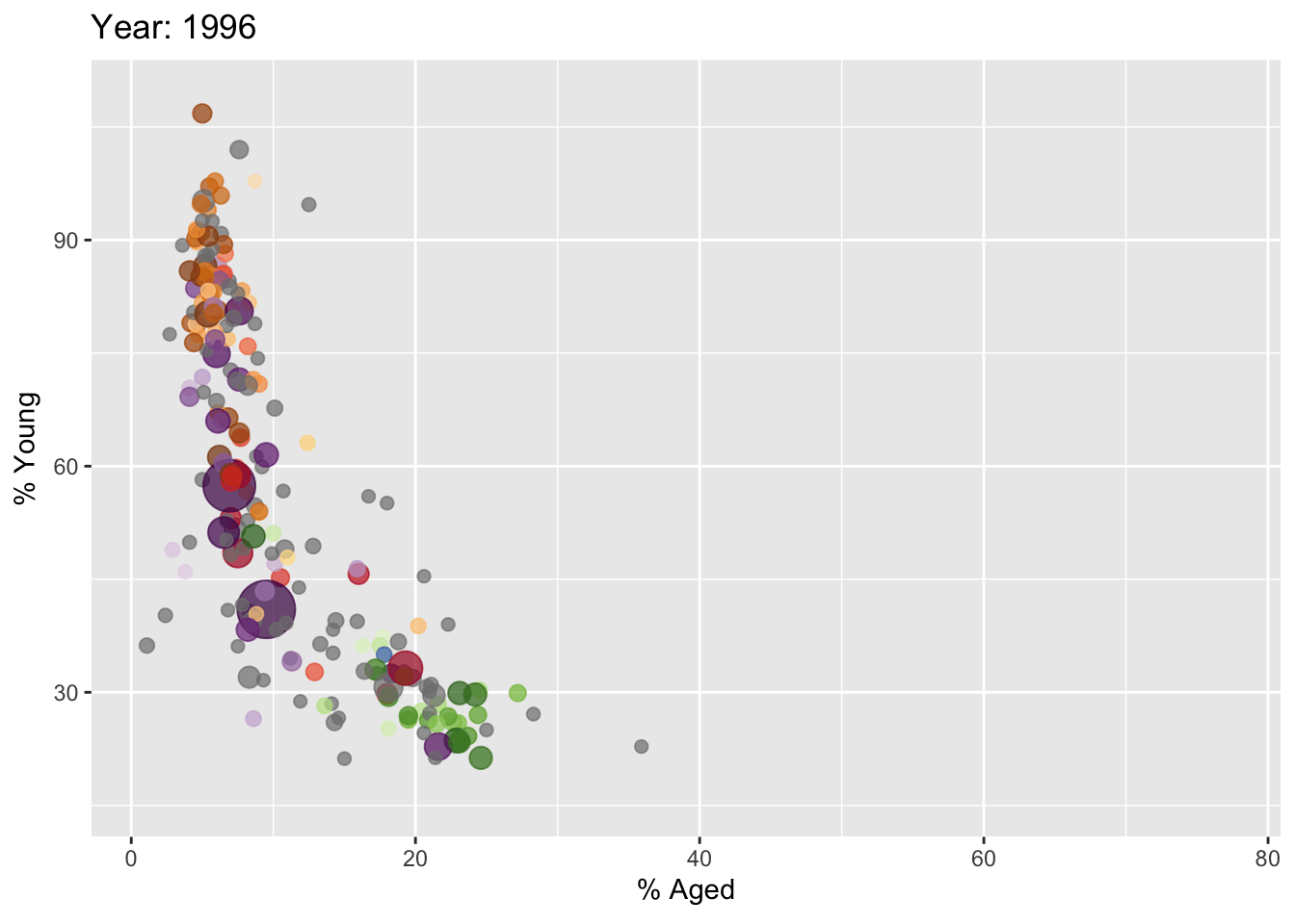
This generates a gif image of the animation.
4 Interactive animations using plotly
In Plotly R package, both ggplotly() and plot_ly() support key frame animations through the frame argument/aesthetic. They also support an ids argument/aesthetic to ensure smooth transitions between objects with the same id (which helps facilitate object constancy).
4.1 Building animated bubble plot using ggplotly()
gg <- ggplot(globalPop,
       aes(x = Old,
           y = Young,
           size = Population,
           colour = Country)) +
  geom_point(aes(size = Population,
                 frame = Year),
             alpha = 0.7,
             show.legend = FALSE) +
  scale_colour_manual(values = country_colors) +
  scale_size(range = c(2, 12)) +
  labs(x = '% Aged',
       y = '% Young')

ggplotly(gg)
It generates an interactive animation, and unlike what gganimate can produce. However, it takes quite a while to render so I have to use this method sparingly.
4.2 Building animated bubble plot using plot_ly()
We can also use plotly() by specifying frame in the plot.
bp <- globalPop %>%
  plot_ly(x = ~Old,
          y = ~Young,
          size = ~Population,
          color = ~Continent,
          sizes = c(2, 100),
          frame = ~Year,
          text = ~Country,
          hoverinfo = "text",
          type = 'scatter',
          mode = 'markers'
          ) %>%
  layout(showlegend = FALSE)
bp
Unlike the ggplotly() method, this does not render interactive legends and the zoom and pan fuctions. Hoever, it renders much faster so this is a good alternative to previous visualization.
5 Reflections
I want to keep things simple so right now, I am leaning towards using gganimate. However, ggplotly provides interactivity, which can be useful especially if there are many frames as the audience can pause to inspect a frame more closely. It comes at a cost of the page being heavy, and if there are a lot of interactive plots in the page, the page may run sluggish for less powerful computers.
Animation is great especially for presenting time-series data with multiple dimensions. When doing Take-home Exercise 1, I wanted to present some animations too so I didn’t need to limit my visualizations to 2 quarters.
I am happy to learn this as this is another powerful tool in my data visualization arsenal.